This summer has been a whirlwind trip of trade shows for me. For most of the hot months, I was walking show floors, speaking to retailers, finding new products, and one of my most enjoyable tasks, discovering amazing display ideas. It’s incredible what a talented designer can do with some simple props, a bucket or two of paint, lighting and fabric. The scenes and settings at this summer’s shows really outshone years past. I hope those of you attending took some time to really observe the ideas and nuances behind the displays.
With fabulous displays top of mind, I thought it would be a good idea to reiterate five top display tips that are important to keep in mind when creating stunning displays.
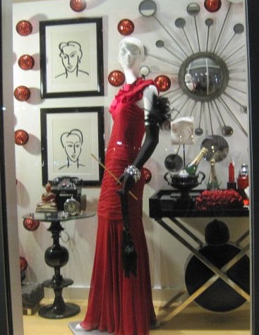
1. Keep It Simple. The top display tip that bears repeating is to keep it simple. Stick to a few amazing props, contain your color palette, determine a focal point, and don’t overload the scene. Your eye needs to be able to clearly focus on the merchandise and also have spots to rest. When there’s too much to see, there’s simply TOO MUCH TO SEE, and your eye will just skip over the entire display.
2. Raise the Roof. Not literally, but remember to add height to your display to make your eye travel up and down. Several showrooms hung various items from their ceilings—witches hats hung from their pointy tops, baskets and crates hung from thick ropes, pillows dangled and twirled from twine, chandeliers positioned over displays, and even the unexpected—bikes, chairs, lamp shades—suspended from the ceiling.
3. Wow Them with Color. A splash of unexpected color will really draw someone to a display. One showroom painted an old motorcycle fire engine red and then positioned it over a furry white accent rug. Another display filled the space with various gilded birdcages. A photo on our Facebook page shows an assortment of table sections all painted purple and attached to a white wall. Find an interesting prop and paint it a bold, bright color. You’ll be surprised how much attention it will grab.
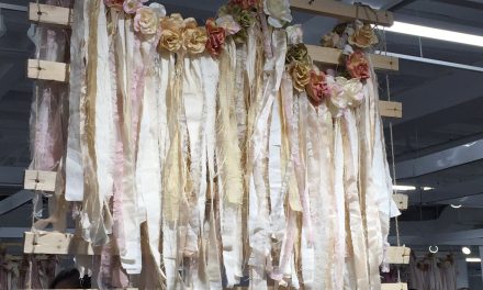
4. Don’t Forget the Backdrop. Just because you’re positioning your display against a wall doesn’t mean all you have to work with is a painted wall. Create something interesting as a backdrop. Hang fabric from the ceiling, or attach shutters or old screens to the wall. Or consider filling the wall with smaller items that enhance the theme. One retro kitchenware display used tons of individual diner receipts attached to the wall as a backdrop. Another used ripped squares of cardboard for a rustic effect.
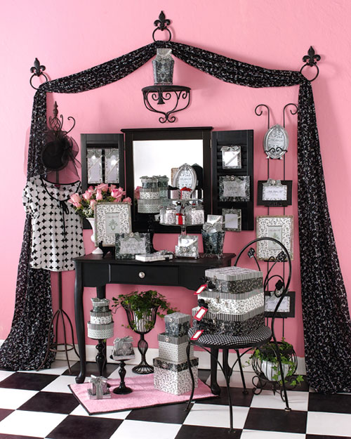
5. Establish a Theme. The best displays have a theme or story around theme. By choosing a theme, you make it easier to create your display, as now you have an idea on what to focus on when choosing props, backdrops and risers. A football-themed display at one showroom included a display “shelf” made from old truck tires and an actual truck tailgate. A garden display incorporated an old cabinet with each drawer pulled out and filled with dirt, into which was displayed various garden stakes. A nautical theme can incorporate pilings, lobster cages and seashells.
Keep these tips in mind when you create your displays, and you’ll be sure to create something that will wow customers.
For display ideas every week, be sure to Like our Facebook page and watch for our Wonderful Wednesday Displays.


