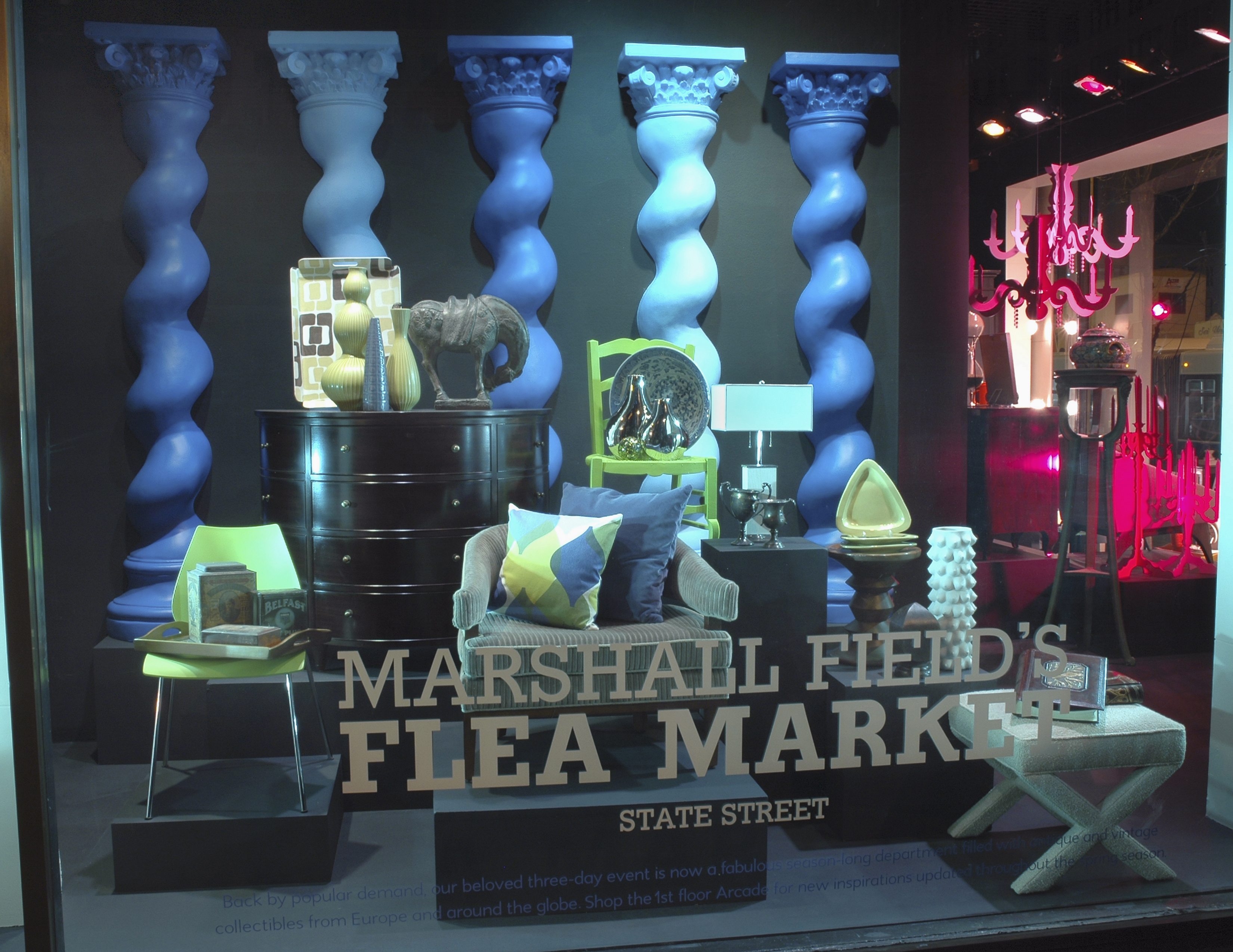
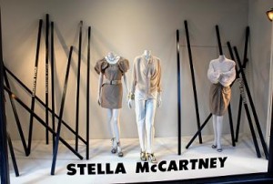
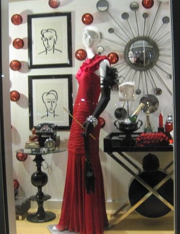
It’s been said that the “eyes are the windows of the soul.” For smart retailers, the windows of your stores are the eyes into your soul. In your windows, you show off what you consider to be your shop’s main draw, your shop’s personality and individuality, and the merchandise that defines your role in the retail community.
For designer, visual-merchandise consultant, and entrepreneur Amy Meadows, windows are the heart and soul of her business. Working as a go-to guru for well-known department stores and top-of-the-line organizations, Meadows founded Windows Matter (www.windowsmatter.com). Her purpose is to provide a “variety of services, but most specifically to meet the needs of independent businesses and business districts. My programs include assessments, coaching, makeovers and more.”
Meadows sat down with Smart Retailer to chat about the ins and outs of making your storefront speak clearly and precisely about your business’s purpose.
SR: What are some of the lessons you impart to your seminar attendees? Do you have some rules or principles they should put into practice:
AM: I emphasize the need to be clean, consistent, and creative. By “clean,” I mean both in terms of visual clutter and housekeeping. Honestly, make that glass sparkle. It makes a world of difference. For “consistent,” do your signs, your website, and your marketing collateral correspond in terms of font, color, and aesthetics? Sit down and think, “Do my displays and props complement my store’s brands?” For “creative,” I don’t mean “artistry” as much as I mean problem solving. Retailers have to be bright, think fast, and be quick to improvise.
SR: A lot of retailers are losing business or at least foot traffic to people who browse on the Web. Is there any way to use the cyber world to a retailer’s display advantage?
AM: Yes, inspiration can come from anywhere, and the Web is a helpful tool in that regard. Maintain a Pinterest board, keep an idea file, be open to what you see around you in life and online. Stay inspired!
SR: What are some of the most common mistakes you see shop owners make with their spaces and displaying?
AM: I think many try to tell too many stories in their displays. I stress “edit, edit, and edit.” Then edit some more!
SR: If a retailer doesn’t have the money to hire a designer or doesn’t have the cash to redo a store right now, what are some quick tips to make their displays pop?
AM: This is a simple one. Stand across the street. What do you see? What does your customer see? If objectivity is too difficult, find a buddy who will give you feedback. If nothing more, spend time cleaning, lighting, and addressing details.
SR: How crucial is it for retailers to have a clever or eye-catching, well-delineated display?
AM: This is a critical component to your shop’s ultimate success. When all is said and done, your storefront still remains your best advertisement.


