How to Incorporate Florals in Displays
by Amy Meadows
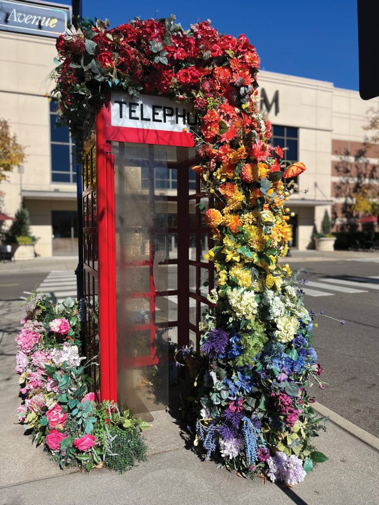
Who doesn’t love flowers? Fresh and fragrant, the right bouquet might celebrate the season at hand or tempt us with floral beauty still to come.
A vase on the cash wrap or perhaps a floral motif in the window can bring a smile on the gloomiest of days. What are the best ways to incorporate flowers into your visuals?
Biophilic design is a trend that focuses on the use of plant material in the retail and hospitality industries. Fig trees and philodendrons bring interest to overlooked corners, and we have seen endless ivy trails through terra cotta pots and Chinese urns.
These additions add color, texture, and reflections from glossy leaves and containers. Integrating florals can be a bit more complicated. The size and style of your container, as well as the types of blooms used, can either clash or complement your store’s look and feel.
Let’s explore strategies for using your time and money wisely to select the best elements to incorporate into various locations.
Floral Categories: Pluses and Minuses
Fresh florals create the optimal “wow.”
Pros: Fresh flower arrangements add interest — and often fragrance — to a store interior. They suggest a bit of a splurge, treating the employees and customers to an unexpected burst of color.
Cons: Fresh florals are harder to prepare and maintain, but here are some tips.
Before placing the stems in a vase with water, remove all the leaves that fall below the vase opening. There should be no leaves in the water — ever. Leaves create messy, cloudy water and breed bacteria, which is why some hospitals now ban fresh florals in patients’ rooms.
Strip the stems and create a spiral, hand-tied bouquet if you can. This video (www.youtube.com/ watch?v=J3b9UnDK1fQ) shows you how to create one.
Be prepared to change the water daily, especially if using fresh floral arrangements in a display window, as sunlight hastens evaporation. You might also choose to mix fresh and dried materials. This is a little trickier but a worthwhile consideration when stretching the budget.
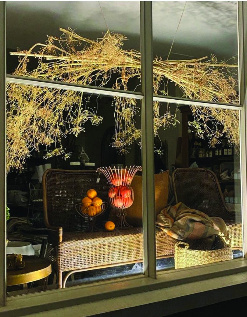
Dried goods are another popular category. Generally offering a more extensive selection than fresh flowers, this option includes branches, pinecones, dried grasses and leaves, and even feathers.
Pros: Virtually no maintenance is required, and the elements can be stored for frequent reuse. While you must check for breakage, as well as for any dust or seeds they might shed, this is usually a safe choice for autumnal décor.
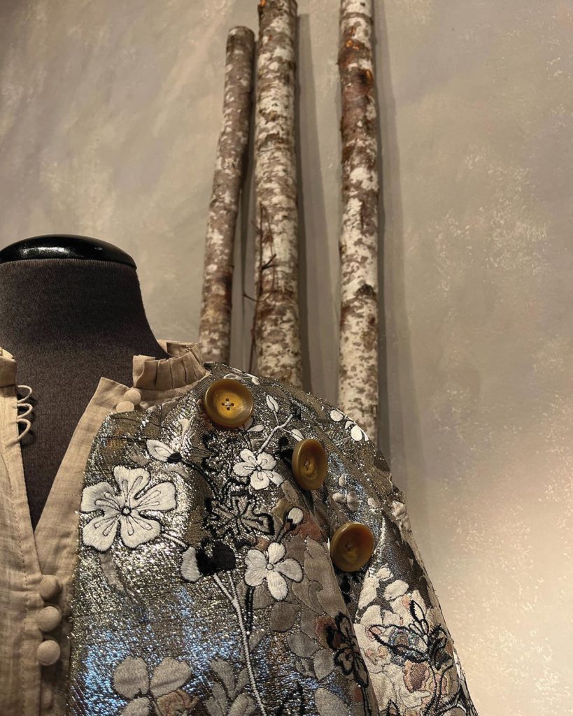
In addition, the branches, twigs, and leaves are typically in neutral colors, so there are no issues with matching an interior or merchandise color palette. Birch logs are especially good for creating cozy, wintry backdrops and arrangements.
Cons: Neutral is not always best. In fact, dried grasses and leaves can often read as old and withered (which they are), but that is not always going to support or reinforce the novelty of “fresh” arrivals.
If torn between these two primary categories, you may wish to consider silk florals.
Pros: There is no sneezing, allergies, wilting, shedding, or (yes, they collect a lot of dust) and stored for future use.
Cons: They have no fragrance and no positive effect on the air quality inside a store. In addition, they are not terribly friendly to the environment, considering the amount of dye used. Finally, silk goods (especially flowers versus greenery) fade because of exposure to sunlight.
Cost considerations have positive and negative aspects. High-quality silk floral purchases cost more than fresh bouquets. Refreshing and replacing live florals has the cost of your time.
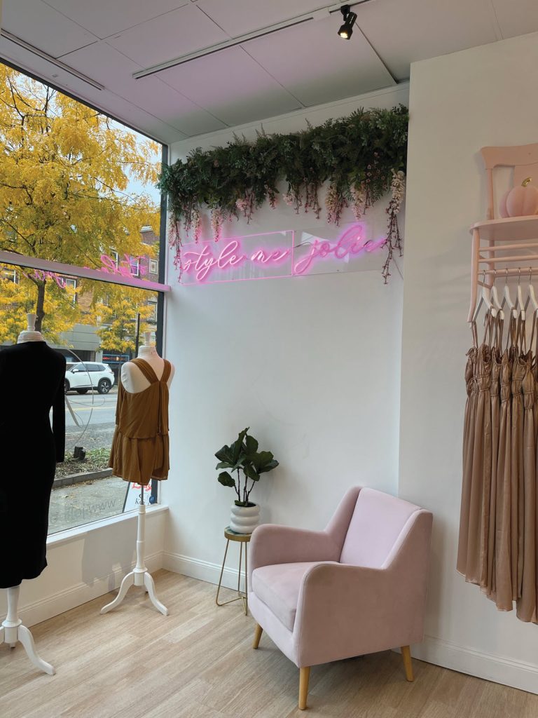
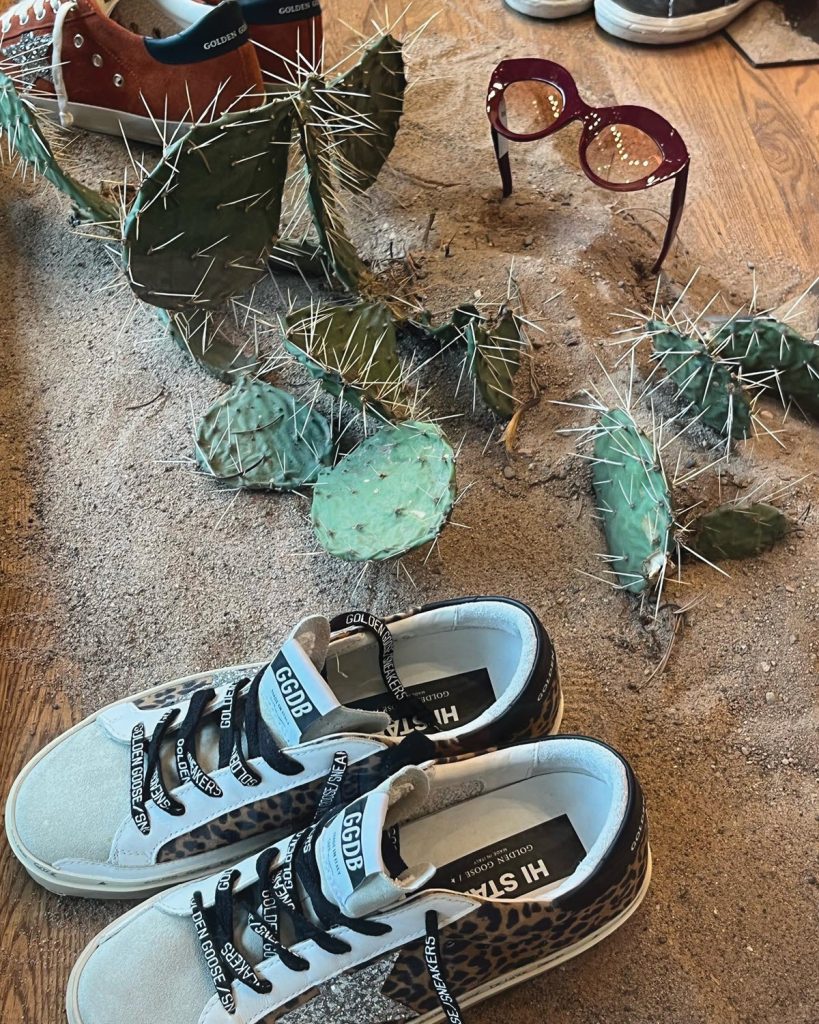
These are the three primary categories for lifelike, natural-looking blooms. Oversized flowers, neon designs, and/or theatrical displays take on additional roles as set pieces and props.
The most likely locations for floral accents are:
- Point-of-sale.
- A trend table or featured product.
- Tops of hutches, cabinets, upper shelves.
- Display windows.
Floral accents at a point-of-sale or cash wrap provide the greatest opportunity for customer appreciation and interaction, especially as one is closing a sale. Always use real flowers in this location, and take time to evaluate the size and scale of the arrangement.
Clear counter space is precious and important for signing receipts and placing bags, so be judicious in your choice of vase size and arrangement volume. A cluster of bud vases or a smaller posy might be the best solution.
Quickly discover how easy it can be to strike up a conversation about the scent, color, or season. Just remember to work with your store’s color palette.
If it is on display in your shop, it must be your “brand,” even the container. There is a world of difference between wildflowers in a Mason jar and roses in a crystal vase. Choose the look that best suits your business.
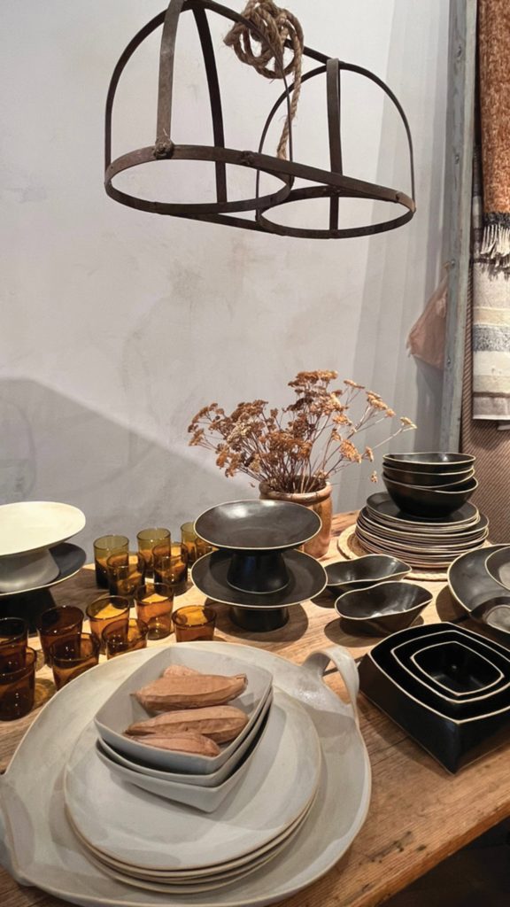
There is a bit more freedom with flowers at a trend table or featured product display. While once again supporting the store’s look and brand, this enhancement can be taller and showier. In other words, go for it!
Create adequate height for viewing from various points around the shop’s interior. If you need to stick with smaller containers, that is fine. Simply look for ways to elevate the flowers within the display. This can be with risers, cake plates, stacks of books, etc.
The one place in your store where silk flowers make sense is in the out-of-reach areas, especially the top shelves in wardrobes or hutches. Whatever you place at that level is not going to be seen under close inspection. I don’t know about you, but if there is a way to avoid unnecessary ladder work, I’m all for it.
As always, display windows can use exaggerated quantities of elements and stylized or oversized props. To catch the passersby’s eyes, the use of scale, color, and placement in intentional and dramatic ways is always a winner.
For the same reasons that flowers in our home or garden lift our mood and enhance the surroundings, flower arrangements, or simply adding branches for texture and a seasonal vibe, make your shoppers smile and your merchandise shine!
Have an interesting display to share? Or a question about visual merchandising strategies for your business or your district? Visit www.windowsmatter.com for more information.


