
By Amy Meadows
Congratulations! You have successfully designed, produced and/or acquired a new gift item. Perhaps it is ceramic, jewelry, or sculpture. What will you select as options for displaying this product in your store?
Maybe you are pitching a tent at an art fair or showing your wares at a trade show or special event. You will have a LOT of competition from other vendors and artisans, so it is imperative that you stand out!
Naturally, the draw should be the merchandise. However, too often where (and how) it is stocked or displayed is a bad fit. This is an ongoing challenge for every retailer and visual merchandiser alike — contrast or congruence?
Contrast
Shiny versus dull. Contemporary versus vintage. Smooth versus textured.
There are countless ways to create the optimal contrast, but it is often a minefield. You must determine the appropriate degree of difference or else it looks like you tried and missed.
I always look to Anthropologie as an expert in the field for this tricky mix and match. They consistently nail the pairings of contemporary products with vintage or antique display tables, chairs, and risers.
Congruence or Consistency
I am always delighted when I happen upon products that are displayed using the very materials from which they were made. I mean, why re-create the wheel or toss the dice on contrast grouping that may or may not match when the wood, clay, tools might be just the ticket.
In this article, I will show you five subtle examples where the products are promoted using tools of the trade. In other words, the same materials are being used for the display settings that were used for the actual product or merchandise.
A Sweet Display
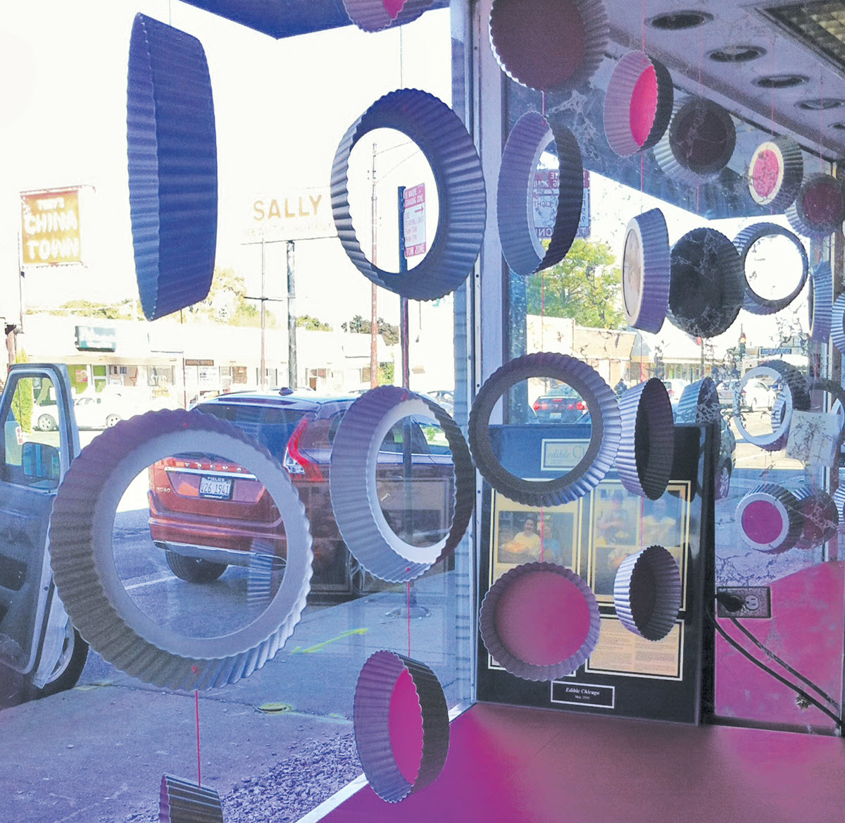
Bakeries can be tricky. Put your goods in the window and watch them melt, grow stale, or fade. Yes, they can be lacquered for durability, but they eventually lose their mouth-watering appeal.
For this bakery, beautifully styled photos of petit fours, specialty cakes, and pastries were the showstoppers. But surely, we could do something a bit more creative than mounting them on boards.
The aha moment came while watching The Great British Bake Off as they used tart pans with removable bottoms. Why purchase ordinary frames when I could enclose the photos in the actual baking pans.
As a bonus, the bakery owner was able to secure these pans at a trade versus retail price. Win-win. Oh, one more plus is these props would then become bakery inventory. Waste not, want not!
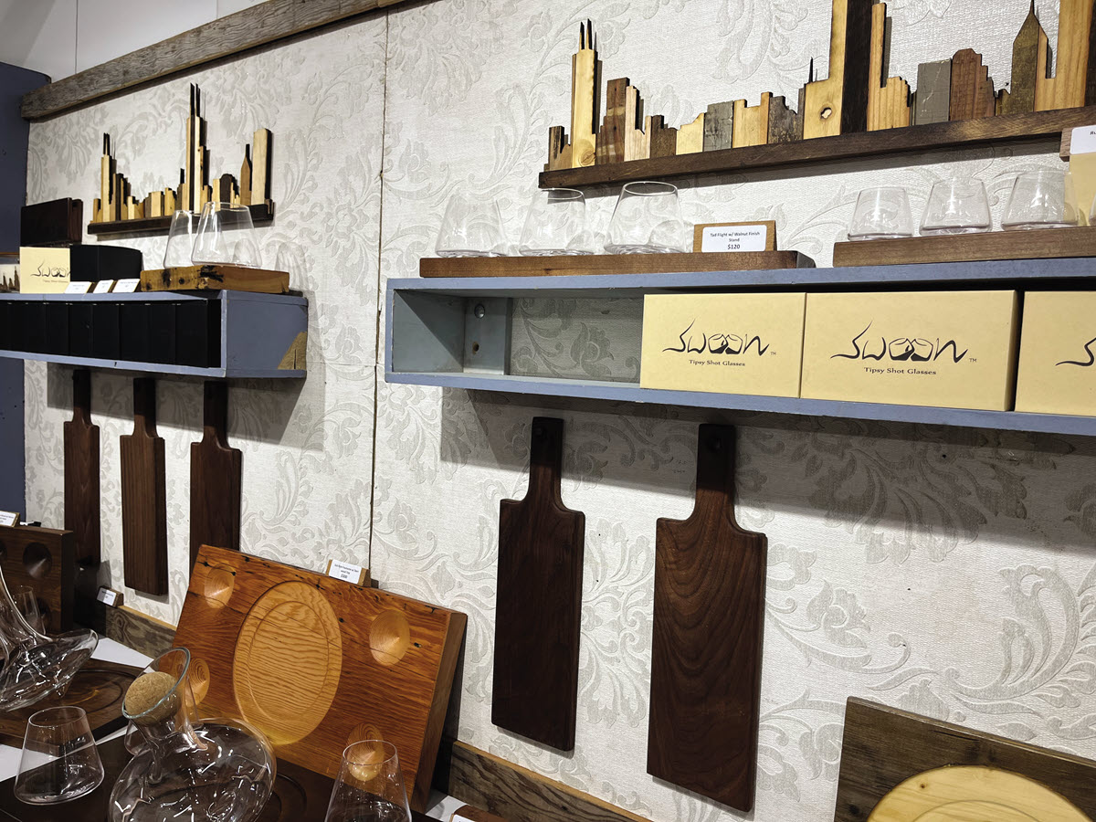
A Warm Design
You are a skilled woodworker, and your creations are exquisitely detailed, inviting close inspection. Shallow, wall-mounted shelves are space-efficient, and they provide close-up views without the customer needing to pick them up.
A natural pairing for wood is … WOOD! This can become a bit of a storytelling moment if you use a less-finished version of the maple, oak, cedar, etc. than what was used to fashion the merchandise for sale.
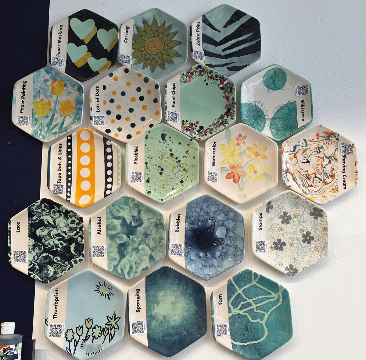
A Blank Slate
Things get a bit trickier when you are featuring an activity or a service. For example, many of us have attended Sip & Paint events or gatherings where friends meet to paint blank pottery.
I love what is basically a monochrome mural of unpainted pieces, such as trays, plates, and bowls. It is neatly gridded, clearly identifies the desk/cash-wrap, and allows the customer to use their imagination and mentally project their finished work on what is literally a blank slate.
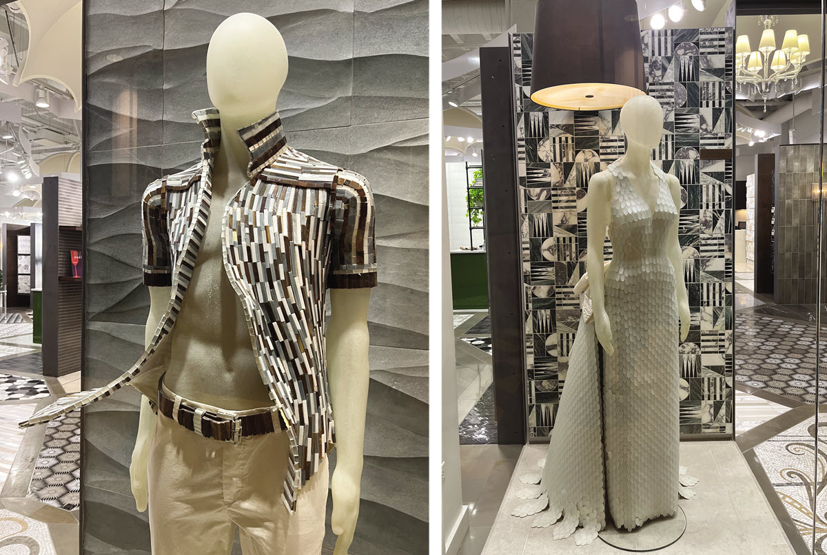
A Creative Idea
In this particular case, the standard tile showroom has re-written the display recipe by not only using white, stone-like mannequins but instead showing the products in a decidedly non-traditional way . . . using backsplash tiles as men’s custom clothing. Creative and eye catching — I would definitely shop there.
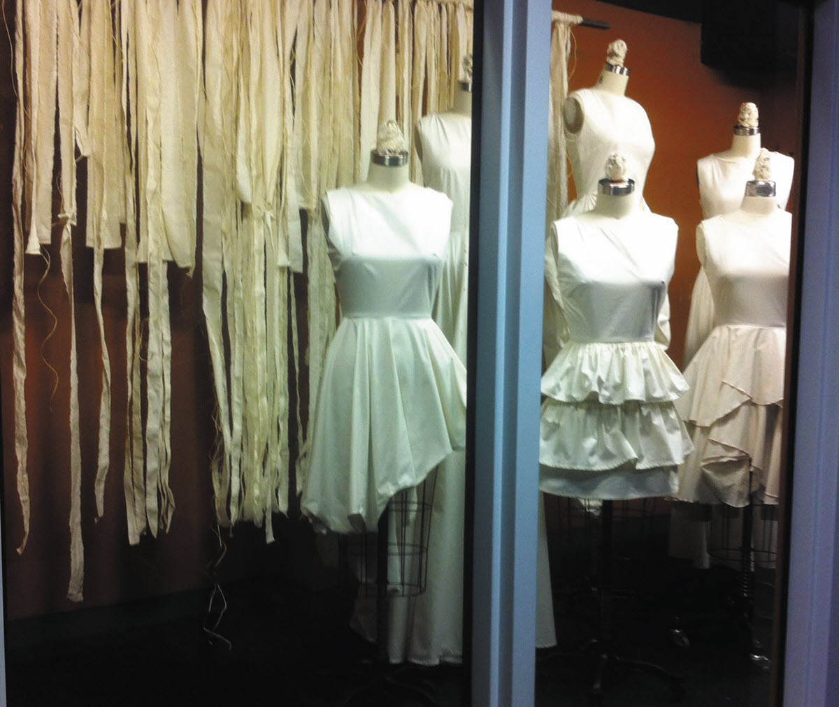
A Source Highlight
Again, consider the source. Or in this case, consider the course, as this was executed to highlight assignments in draping and pattern-making in muslin. Quite frankly, it would not make sense to use a backdrop or prop that was not muslin!
In summary, do not struggle to reinvent the proverbial wheel. Tell me how it was made, the types of materials used, and help me appreciate the effort the journey required.
Have an interesting display to share? Or a question about visual merchandising strategies for your business or your district? Visit www.windowsmatter.com for more information.

