
By Amy Meadows
What is the very first thing a customer notices about your storefront? It is the name of your business on your sign.
Be it temporary, vintage, illuminated, printed on an awning, or suspended overhead, this is your larger-than-life business card. With considerations that include weight, weather-resistance, and durability, it is important to understand the many options available.
Let’s begin with the largest, usually overhead, permanent signage choices and work our way down to the more immediate, line-of-vision lettering and graphics.
Exterior Storefront Signage
In most instances, this will be dimensional lettering or an engineered, structural unit mounted overhead. Before you begin looking at products, check your zoning ordinance. Trust me, you do not want to run into issues with public right of way.
Different cities and towns have different guidelines, so be sure to contact your local government offices for details. I live and work in Chicago and the exterior signage rules (including awnings) can best be described as “draconian.”
Cabinet and Box Signs
Fully enclosed, these internally lit signs provide opportunities for multiple colors, images, and lettering styles.
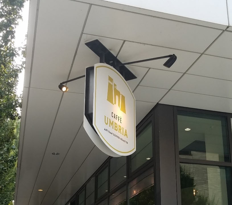
Blade Signage and Panel Signage
Blade signage is a panel (lit, dimensional, and/or contour-cut) that extends perpendicular from the façade. Because this might swing back and forth in the wind, engineering and support are critical.
In addition, because it hangs over the sidewalk and the pedestrians, permits and inspections are part of the commitment. So, why do it? Because they project into a person’s line of vision as they are walking or driving by.
And do not forget the lighting! If you are NOT using an internally lit sign, you need to add lighting.
Streetlamps provide insufficient illumination. How many lights? How far apart? What size/wattage of bulbs? Do the math as far as the “throw” is concerned. As always, I recommend working with an architect and/or electrician to ensure you are making sound (and mechanically safe) investments.
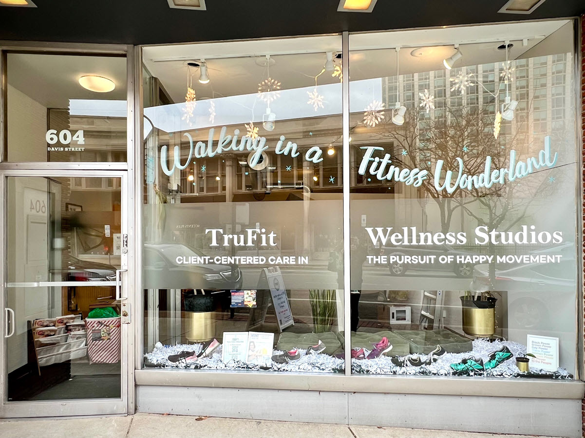
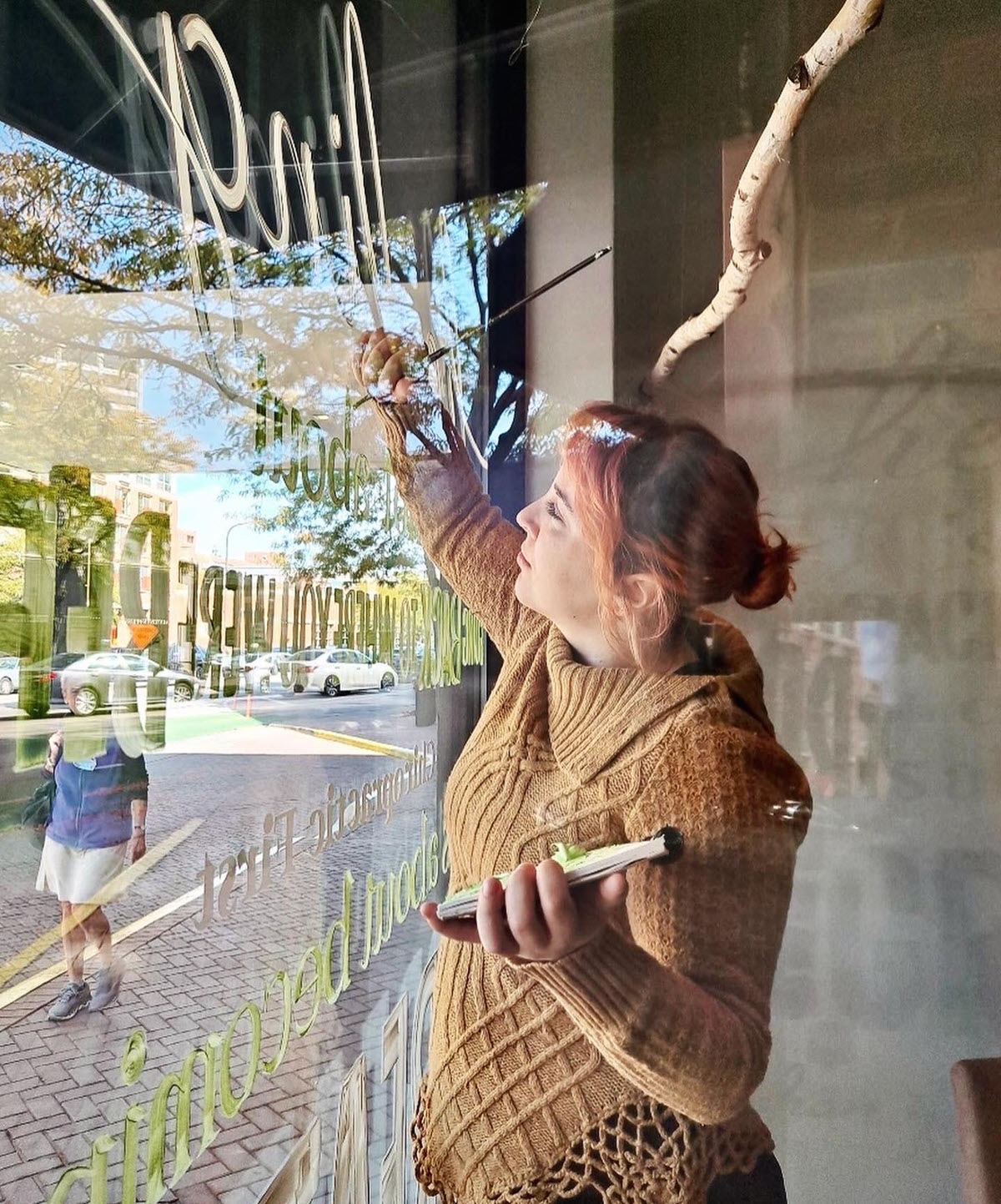
Applied Signage
I use vinyl for most of my projects. Easily produced and easily removed, it can be customized to match specific logo lettering, colors, and even photographs.
Note that I did not say it is easily installed. The installation process depends on the temperature and whether the vinyl is being applied directly to the glass (first surface) or from the back of the glass or inside the store/window (second surface.)
Using professionals with torches, cleaning fluids, knives, and burnishers is worth the money you pay to hire them. Again, trust me on this!
I enjoy working with Cushing & Co. here in Chicago. They have extensive resources, materials, and designers to help negotiate the best methods for achieving my project goal. The biggest hurdle might be the weather. Or the timing. Or the budget.
Their tips for selecting a vendor include choosing someone who:
- Asks who the audience will be and how long the graphic needs to last.
- Provides guidance on how to preprep the surface or (for interior signage) is willing to speak directly with contractors about when the last wall needs to be painted in time to fully cure.
- Wants to verify the site measurements and make sure the conditions are appropriate.
- Recommends alternate materials and works with your budget.
If you are an artisan or craft artist, you might have a machine at home for cutting thick materials. It allows you to produce contour-cut lettering from simple graphics files.
I frequently spot workshops and classes at JOANN, Michaels, and other craft supply stores. If you want to learn more, pop in at one of them.
Don’t want to buy one of these machines? Check your local library. The increased emphasis on “maker spaces” often means sewing machines, vinyl cutting equipment, and 3D printers are available for use at public libraries.
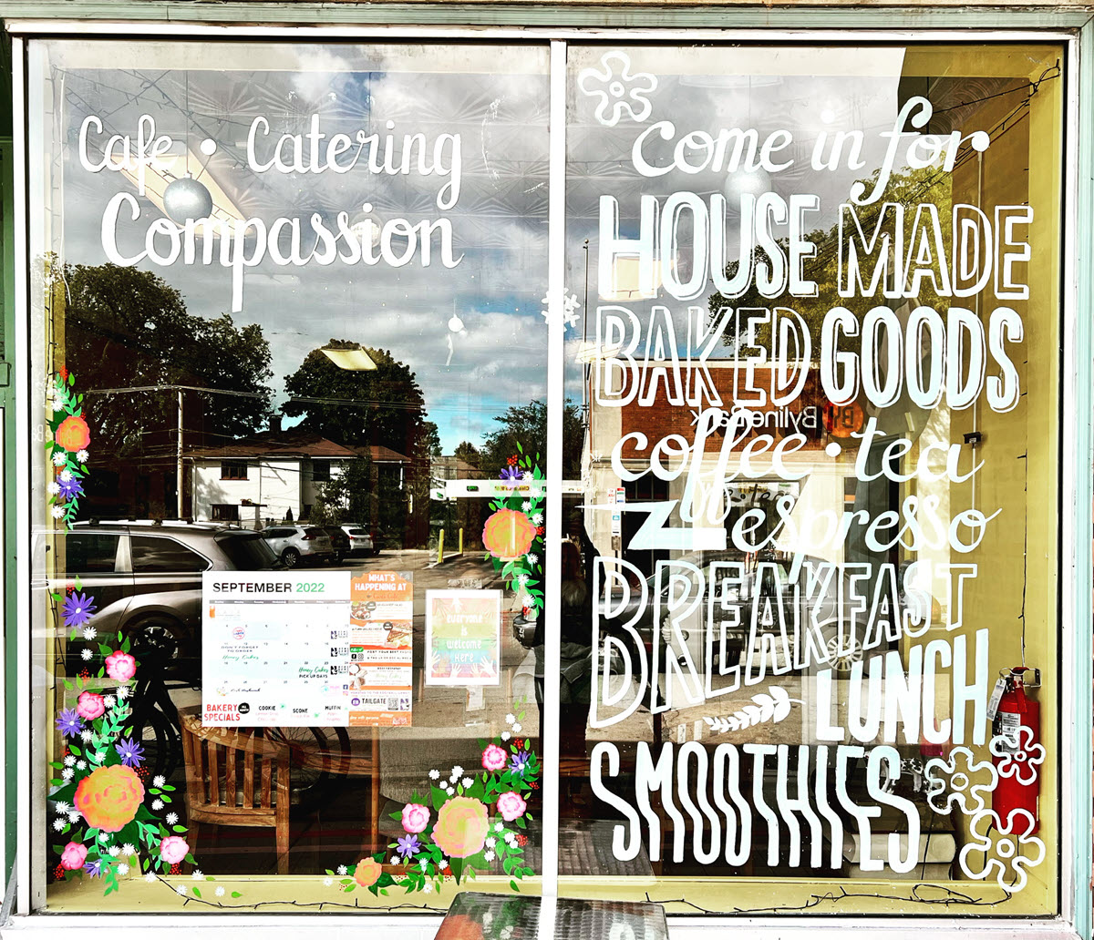
Chalk/Paint Markers
Along with new technology for consumer use, such as 3D printers and vinyl cutting machines, there is also a steady stream of new art supplies and products for both consumer and commercial use.
The chances are high you enjoy a chalkboard sidewalk sign for the ease of changing information. But, ugh — all that leftover chalk dust! Or left-handed smears (that is me, sadly).
I never see that on a Starbucks menu board, and here is why: There are chalk markers, paint pens, and spray chalk to prevent chalk dust and smears.
Emma Moss uses them all. A skilled, creative artist and illustrator in the Chicago area, she is taking us behind the curtain, so to speak, with pro tips for planning your design options — from cost-effective, short-lived installs to more durable ones.
“A chalk marker is a wet erase medium, so it comes off of glass easily with Windex and a towel. It’s a little trickier when working on a board or more porous surface,” she said. “I find that Mr. Clean Magic Erasers work wonders.”
Regarding acrylic paint, Moss said, “I find this a really good material for lettering and illustration on windows — although the caveat for lettering is that when painting on the inside, you have to work backwards. Removing is possible with a Windex soak and a razored paint scraper.”
She has also worked on a more permanent version of this with enamel paint. “This is ideal for clients who know they may keep something up long term and who also clean their windows frequently (acrylic breaks down on glass when met with prolonged moisture,” Moss said.
By using digital illustration tools, Moss can create mock-ups for clients. Do not wave off a mock-up or say, “Oh, I’m sure it’s fine.”
Not everyone envisions outcomes in the same manner. That single picture is worth a thousand words — and possibly hundreds of dollars.
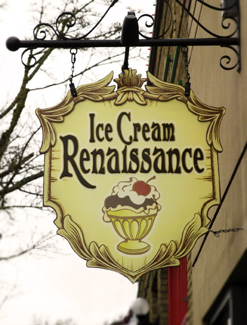
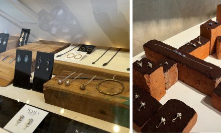
The photo on page 40 is the blade signage created for Ice Cream Renaissance. The project was led by retail designer Seanette Corkill of Frontdoor Back.
That image is the result of reviewing the original plan. It showed a significantly lower visibility of the name when it was superimposed on the artwork. “A deft logo split” et voilà!
Have an interesting display to share? Or a question about visual merchandising strategies for your business or your district? Visit www.windowsmatter.com for more information.

