By Amy Meadows
Maximizing Display With Shortage of Merchandise
Perhaps you’ve been stymied by recent supply-chain glitches, or you’ve encountered the annual post-holiday, empty-shelves dilemma. Regardless of the reason, low inventory — and the resulting merchandise gaps on fixtures or in displays — are a headache. Should you embrace the empty space? Yes. Should you look for filler to avoid empty spaces? Yes to that as well.
Less Is More
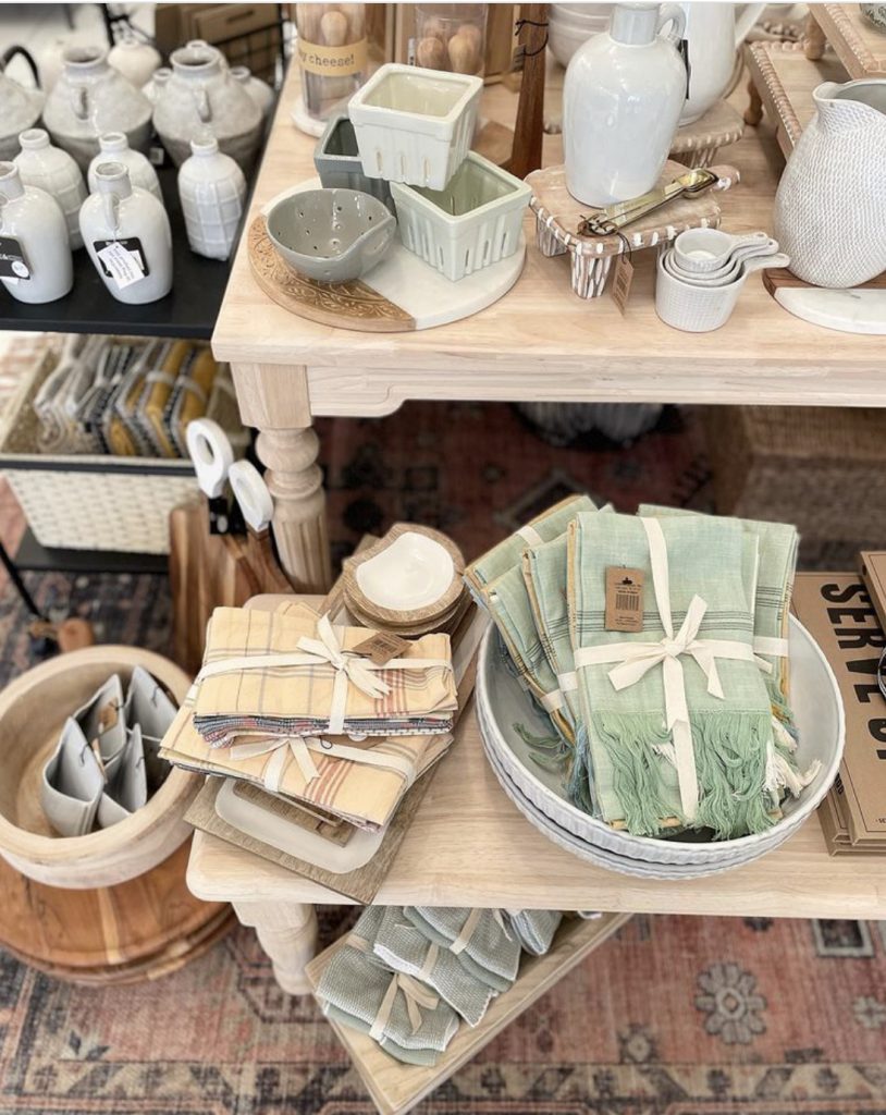
Studies continue to show that when consumers see merchandise in multiples and in crowded fixtures, their reaction is negative. But fewer duplicated items, with more room to breathe, conveys that the merchandise displayed is special, likely to sell through quickly, and should be purchased right away. Crowded shelves and items in quantity scream “discount” to the average consumer.
That doesn’t mean, however, that fixtures lightly sprinkled with merchandise are necessarily sales drivers. While many of last year’s shipping and delivery difficulties have been resolved, a steady arrival of goods means a constant need to rotate merchandise throughout your store. An informal survey of visual merchandisers, shop owners, and buyers elicited the following replies:
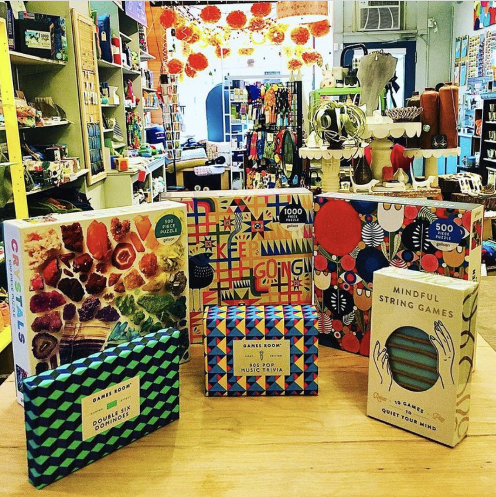
“Puzzles! We’ve been filling the empty shelves with puzzles!”
Puzzles and books are flexible. They can be merchandised with the spine or lid-edge facing out or spun to fully face front as space allows. You can also look at reducing the number of rows per surface, shortening stacks, and adding risers.
“Plants and large-scale planters are saving the day.”
Plants, fresh flowers, and even vases of branches, add color and texture. The biophilic design trend continues its impact on décor and product development. Within your shop’s footprint, choose a single type of plant or flower (succulents, branches, or potted annuals) that will work throughout the entire shop. Maintain consistency with height, color, and containers.
“Double-exposing inventory, using larger graphics, and reducing the fixture footprint have helped us.”
Double-exposing specific inventory items or categories is a divide-and-conquer strategy. Be intentional, don’t just randomly scatter products throughout the store. Find an additional area in a nonadjacent zone. You might offer extra product as an impulse item at the point-of-sale or as a featured item near the restrooms or dressing rooms. Avoid double-exposure of full-price merchandise in a markdown area.
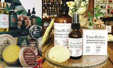
“We buy from as many local vendors and artists as we can. In some cases, this was an opportunity for them to showcase new products.”
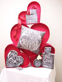
Here’s another great opportunity for reducing empty shelves and driving business. Nicely printed and framed signs are terrific ways to share stories about the artist or a specific product currently in stock or items on backorder. Educate the customer, build shopper engagement, and make the fixture look a tad less forlorn.
Let Them Breathe
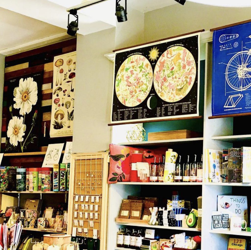
There’s no rule that says you need to have merchandise on every available surface. If anything, the opposite is true. Shoppers’ eyes seek blank areas to rest, absorb, and process visual information. Some stores are full, while others are overwhelming and chaotic. Don’t be that store.
Look for breathing room along your shelves, tables, and within the overall layout. Where feasible, widen your aisles. Do you have nesting tables? When products are running low on them, combine what’s left on the larger one and move the smaller table underneath the larger one.
If you have hutches and armoires, skip product placement on the highest shelf and those closest to the floor. Use the upper area for a decorative vignette or signage, which also draws the customer’s eye further into the store along the perimeter.
Slat wall areas can be simplified. The beauty of a slat wall is that you can scoot entire wall configurations up one or two grooves, and that modest realignment makes the wall look brand new. If you can no longer justify the space needed for longer rods for hanging clothes at shoulder height, switch to waterfalls. Longer glass shelves can be switched with shorter ones. As with hutches and armoires, remove the topmost items and hardware.
If you’re planning any changes in floor layout, fixture placement, or slat wall configuration, I recommend you map it out in advance. Use either paper or painter’s tape to mark boundaries and tentative locations. It takes a little extra time, but it’s nothing compared to the time spent undoing everything later if your guesstimate doesn’t work!
Share the Space
This could be the perfect opportunity to test-drive a possible collaboration or provide your customers with an opportunity to learn about a local organization, fundraising effort, or upcoming event. Although this might not bring in additional sales revenue, it will reinforce your standing as a good neighbor and supportive community member.
Embellish
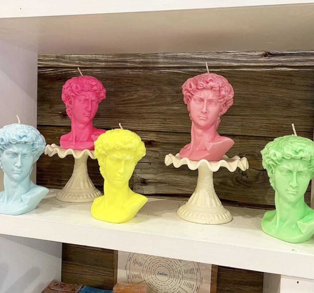
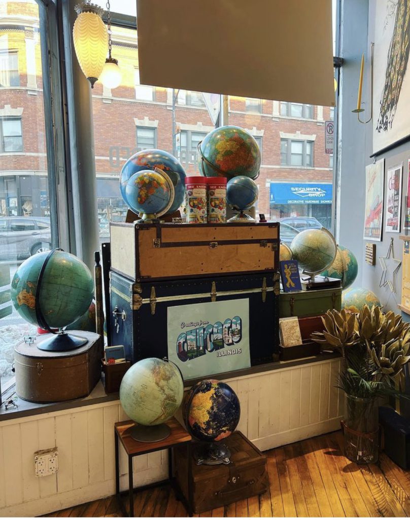
If plants and flowers aren’t a good fit for your store interior and individual display areas, consider enhancing your visuals with props. Vintage suitcases, cake stands, and stacked books are easy, effective ways to add height and color while adding a bit of filler.
What other solutions have you implemented? I’m eager to hear your successes!


