By Amy Meadows
In today’s market, more shoppers are expressing a desire to buy items that are made locally or merchandise that is “Made in the USA.” How can we best support (visually) efforts to promote products made domestically?
It might be an annual celebration around July 4th, where items made in the United States are front and center for several weeks. Likewise, it might be your goal to feature these items in an intentional fashion year-round.
Options could include special signage on items as they are displayed throughout the store or the creation of a dedicated fixture or zone, with all related merchandise in a single location. Personally, I prefer the idea of a dedicated location (not a fan of scattering, per se). Yet, that is not necessarily practical for everyone.
And, if done well, the scattering method can help lead shoppers through the store. This is your call. What is imperative is ensuring consistency across the props and signage in use.
Made in America
How do we promote the advantages of buying items made in the United States? Here are a few ways:
- You are helping drive the nation’s economy.
- You are avoiding supply chain issues from overseas shipping.
- You are supporting your neighbors, colleagues, and artists.
For many shoppers, this is a win-win. We need to make it easy for them to find the products and learn the stories behind the merchandise.
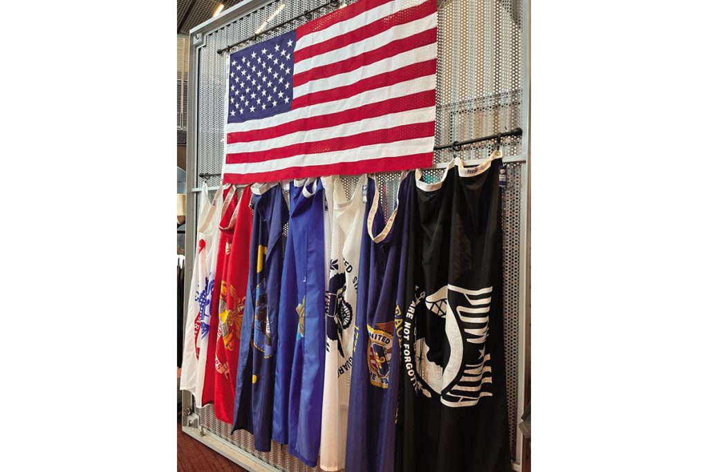
As I conducted research for this article, approaches tended to fall into one of two categories — flags or maps. One is flat, the other one flies, and there are a myriad of opportunities to adapt them for customer engagement — and sales.
Some of the better-known décor specialists offer Americana items that lean toward rustic. This is an excellent way to utilize reclaimed lumber, fencing, or pallets. Think barns and amber waves of grain, and yes, barrels and wheat sheaves work well in this setting.
If you choose to use the U.S. flag, please acquaint yourself with the proper ways to display it. The symbol comes with rules for hanging, wear and tear, and even the proper way to dispose of it when the flag can no longer fly in public. To overlook or abuse any of the guidelines would have the opposite effect of promoting sales.
Consider Other Techniques
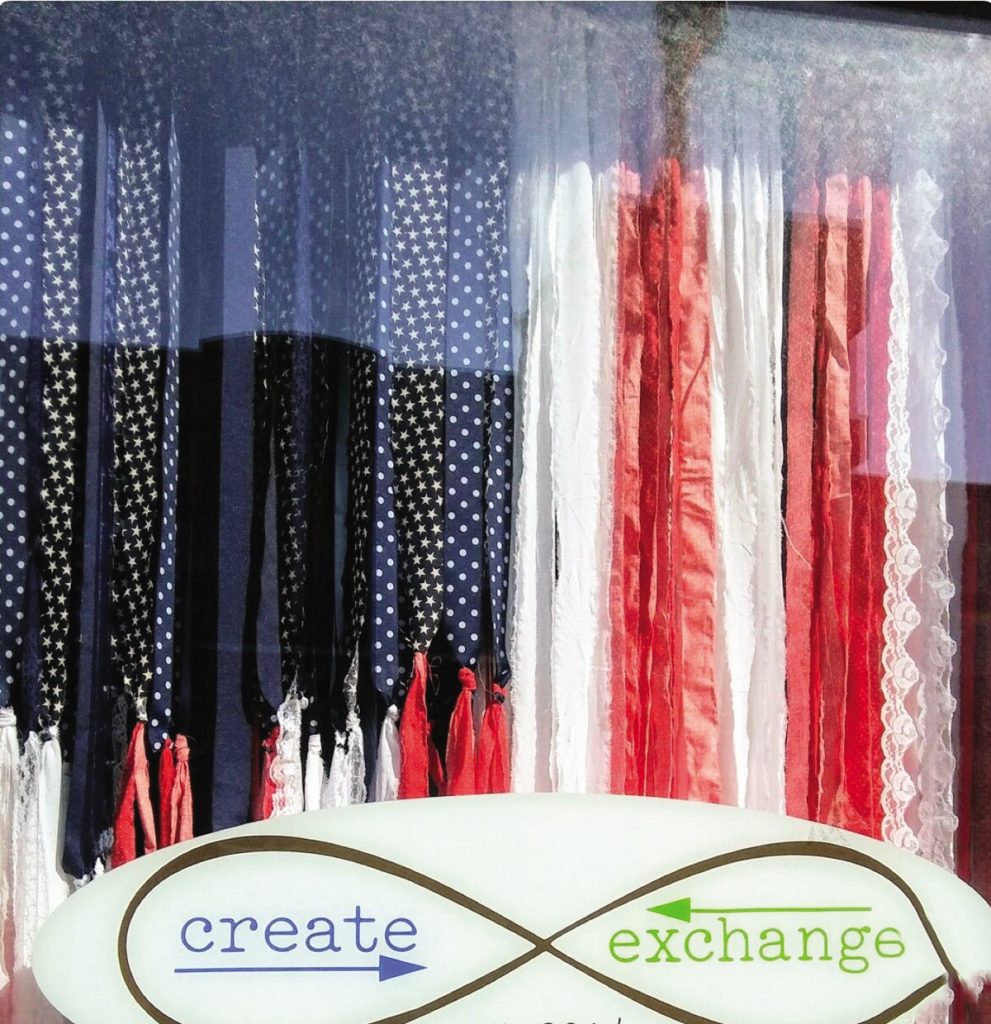
You might also choose to reinterpret the U.S. flag by means of varied materials — the stars and stripes — not necessarily reproducing them exactly but in proper proportion, etc. One of my favorite uses of this technique was executed by Create Exchange, in Cedar Rapids, Iowa.
The owner, Jennifer Stewart, provided behind-the-scenes information. “I made the flag specifically as part of a July/patriotic window display. It is 4 x 6 feet, strung on twine. My store is a second-hand arts and crafts supply store,” she said. “Most items used in window displays, including the flag, are made from store inventory as a way to show customers how to use materials that otherwise may have been thrown away. Materials used for this project are cotton fabric, lace trim, and specialty yarns. All the strips are attached to a length of twine. So even though it’s heavy, it’s easy to hang up and easy to store.”
What a perfect way to promote one’s business! In this instance, she is literally using what she sells to promote the store — arts and craft supplies. She is inspiring creativity and driving sales!
I have also seen flag motifs recreated from flowers, red/ white/blue sneakers, upholstery swatches, bottle caps, and yarn. The possibilities are endless.
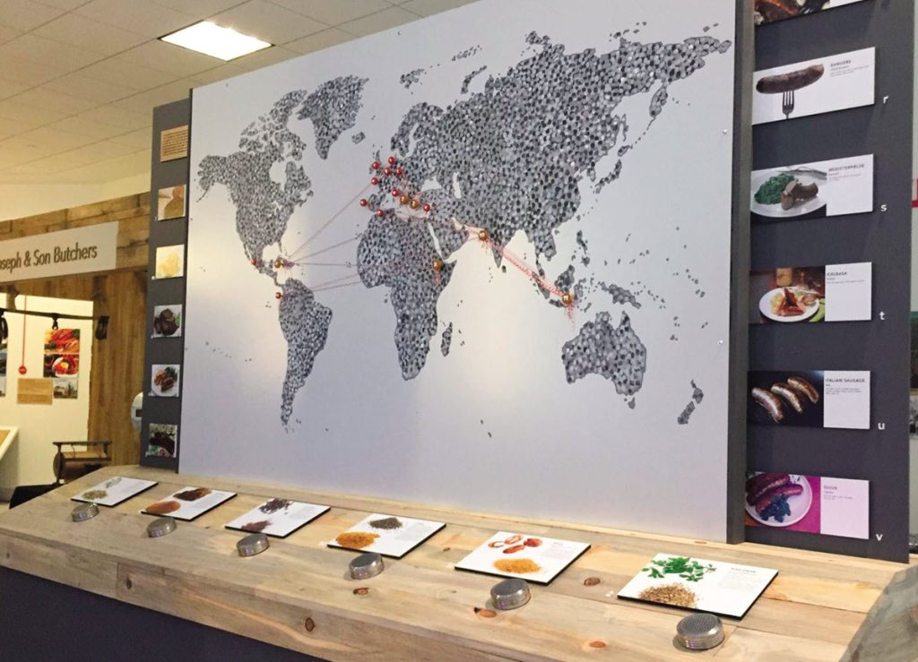
If flag use is not the desired design approach, I recommend maps. Whether small, large, analog or, digital, they can outline the United States as a nation or outline a state or region of origin. They serve as a way to better educate the shopper.
This could then tap into nostalgia (hometown? favorite vacation spot?) or perhaps your bucket list. Maps with pins or other markers are also a terrific way to connect with your shoppers and demonstrate the breadth of your customer base.
You might choose to use a map for tracking the path — or timeline — of a product or a craft tradition. I am thinking about weaving, carving, and other regional or historical arts/ artifacts.
Again, engage the shopper. Explain and educate. And whether it works best to consolidate or distribute your USA-made items, I salute your efforts!
Have an interesting display to share? Or a question about visual merchandising strategies for your business or your district? Visit www.windowsmatter.com for more information.


