By Nicole Leinbach
As a self-described retail geek, getting to visit retail stores across the country as part of my “job” has been one of my greatest pleasures.
Whether it is in Las Vegas during a trade show visit, Milwaukee after speaking at a retail conference, or Nashville between site visits for an upcoming B2B wholesale event, I always find time during my frequent business trips to visit retailers.
In fact, over the last six months alone, I have explored stores in New York, Tennessee, Kentucky, Wisconsin, Florida, Colorado, Wyoming, California, Nevada, and even Mexico.
With retail always top of mind — even in my free time — I am constantly looking for opportunities to gain new ideas and share great ideas from the various stores I visit. Some of my favorites include the following places.
PHOTOS COURTESY OF NICOLE LEINBACH
LoveShackFancy in New York City
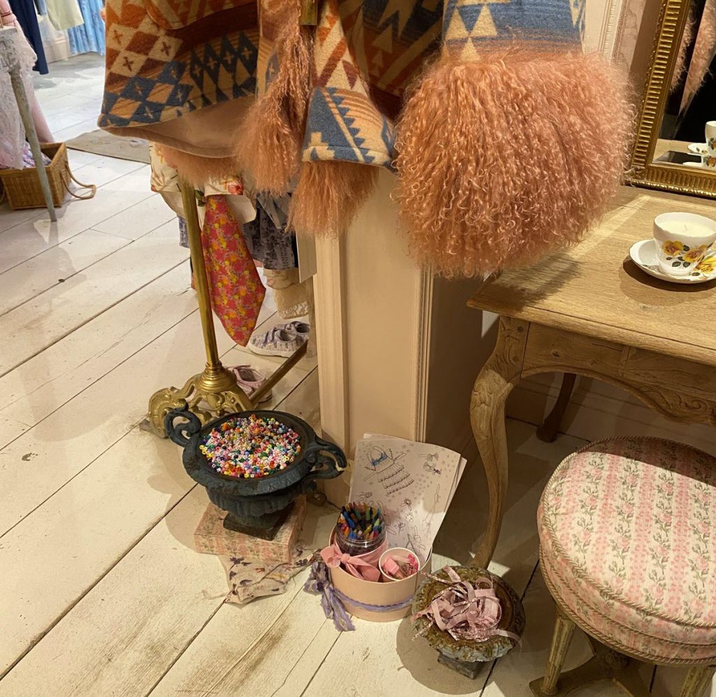
On a beautiful January afternoon, I took my daughter to a LoveShackFancy store as part of her 18th birthday mom-daughter trip. The location was its New York City Upper East Side store, where there was a dedicated area for the little shoppers who often accompany their more mature loved ones.
Any multitasking mother or caretaker appreciates having a distraction for their children while they try to shop, and I loved how this was positioned at eye level for LoveShackFancy’s youngest guests. Additionally, not seen in the photo was the adoring affection of store staff who encouraged young store guests to enjoy this area.
In return, their mothers gained more uninterrupted time and shopped more leisurely. This also meant there was an opportunity for transactions to take place.
When trying to create a space for children in your own store, do not overcomplicate it. Washable crayons, paper with or without images, and a corner or out-of-the-way spot for youngsters to sit and color can often do the trick.
Another lesson to consider from LoveShackFancy is to make a space that still complements the branding and aesthetics of your own store. This is a minimal investment strategy that can directly influence stronger sales, so if your shoppers frequently bring in young guests, consider how building a similar space can help your store.
Studs in New York City
Shopping was the highlight of my daughter’s birthday trip, and despite a Broadway show on the calendar and even a fashion show during Fashion Week, stores got all her enthusiasm.
One of the stores was Studs, which offers ear-piercing services by appointment. In the waiting room of its SoHo location, guests could enjoy exploring beautiful, curated faux ears with stylish earrings and ideas for guests to choose from.
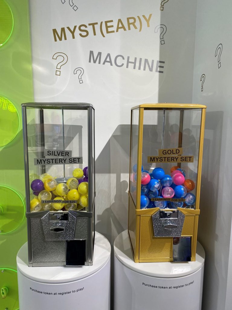
What caught my eye the most, though, was this mystery-gumball-style machine that offered either gold or silver earring options. Over the course of about an hour there, I must have seen five customers gamble on this mystery experience. However, what I took away from this was not so much the love of the earrings but rather the curiosity of the experience that customers gained.
Incorporating experiences is a great way to introduce “shoppertainment” to your store environment. It also helps move slow-moving inventory, sell high-margin items, and create a fun moment of excitement in your store.
Consider how this same concept of a mystery purchase could work for your unique business. Whether it is in a gumball-style machine, a wrapped gift box with a big question mark on it, or another method that will stoke customers’ curiosity, the mystery is what you are selling here.
Casino Boutique in Las Vegas
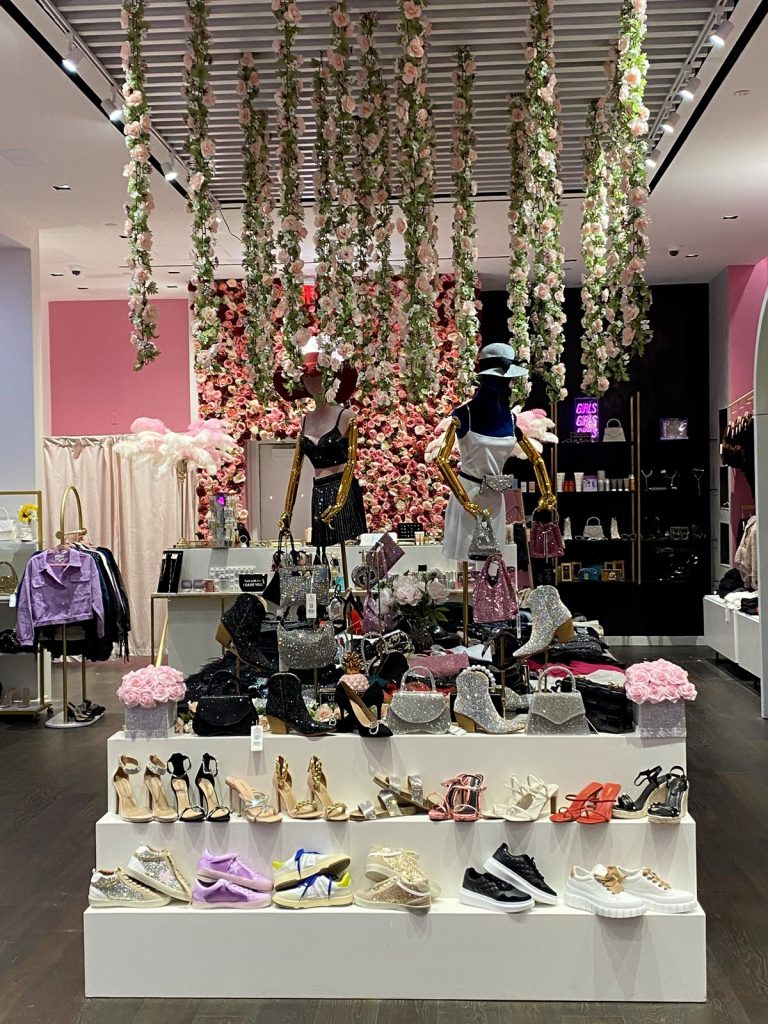
When customers enter stores, they often instinctively turn right. But they also look up if their head is pulled in that direction, which is what I adore about this simple yet effective merchandising moment at a Las Vegas casino boutique.
Using all angles of a store environment is an impactful way to boost customer engagement and provide effective merchandising. In your own store, consider how signage, displays, and even inventory can be included in your ceiling displays — as well as how to do this on a budget.
As the corresponding image demonstrates, a bold statement does not have to be expensive. But it can be a powerful way to get customers to pause and enjoy the experience of an effective display.
Nail Salon in Lake Las Vegas
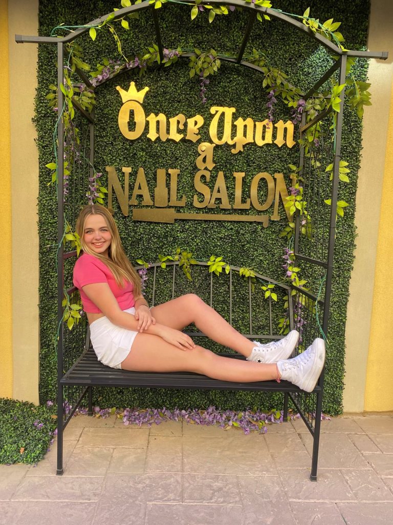
Outside of the hustle and chaos of Las Vegas is a quaint little town called Lake Las Vegas. On a March spring break trip with my two youngest kiddos, my then-14-year-old daughter could not resist a photo-op on a bench outside of an adorable nail salon.
Despite not getting her nails done that day, she was the first one to run to this bench and insist on a picture. Additionally, she probably took a few hundred Snapchat images and shared them with her friends of this same location. This meant the store’s logo was seen by many potential customers within my daughter’s immediate network of friends.
Moral of this story? Customers like to engage with the environments they spend time in. This is increasingly important for millennials and Gen Zers who love to capture images as part of their communication with friends, peers, and family.
Keeping this in mind, how can you create a snappable moment in your own store? Consumers often refer to this as an Instagram moment or Instaworthy.
Whatever the case may be, give your customers a reason to want to take a picture and push your store onto their feed of friends. The result? Organic marketing of your store to potentially like-minded consumers.
Patterns & Pops Boutique in Denver
Affordable displays are one thing. Affordable, good-looking displays are something else entirely.
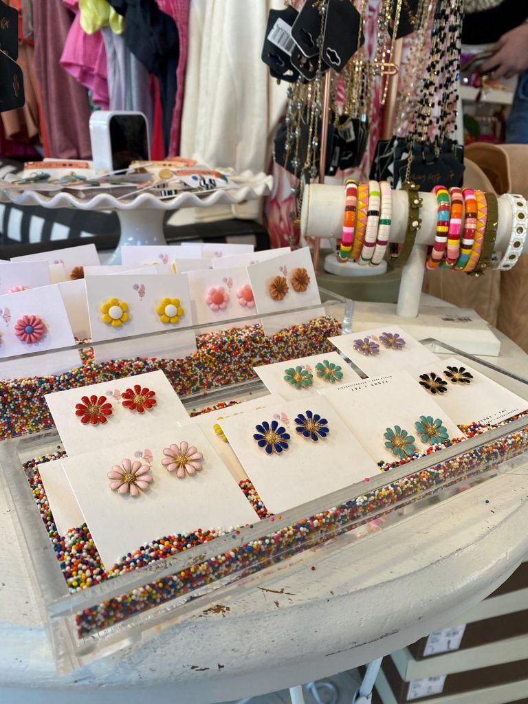
With Denver being home, I often find myself strolling in and out of stores whenever I get a chance. One of my favorites to visit is Patterns & Pops on Platte Street, where I recently discovered this adorable — and affordable — display of accessories in mixed, assorted cupcake sprinkles.
The pop of color, whimsical display, and easy-to-access inventory made this a fun way to engage as a customer. Looking into your own pantry, think about what may work to help bring new life to displays in your store.
From rice to quinoa to pasta to beans to candy and more, consider what aligns with your branding and inventory to elevate store displays on a fun level without breaking any budgets.
Nashville Airport Store
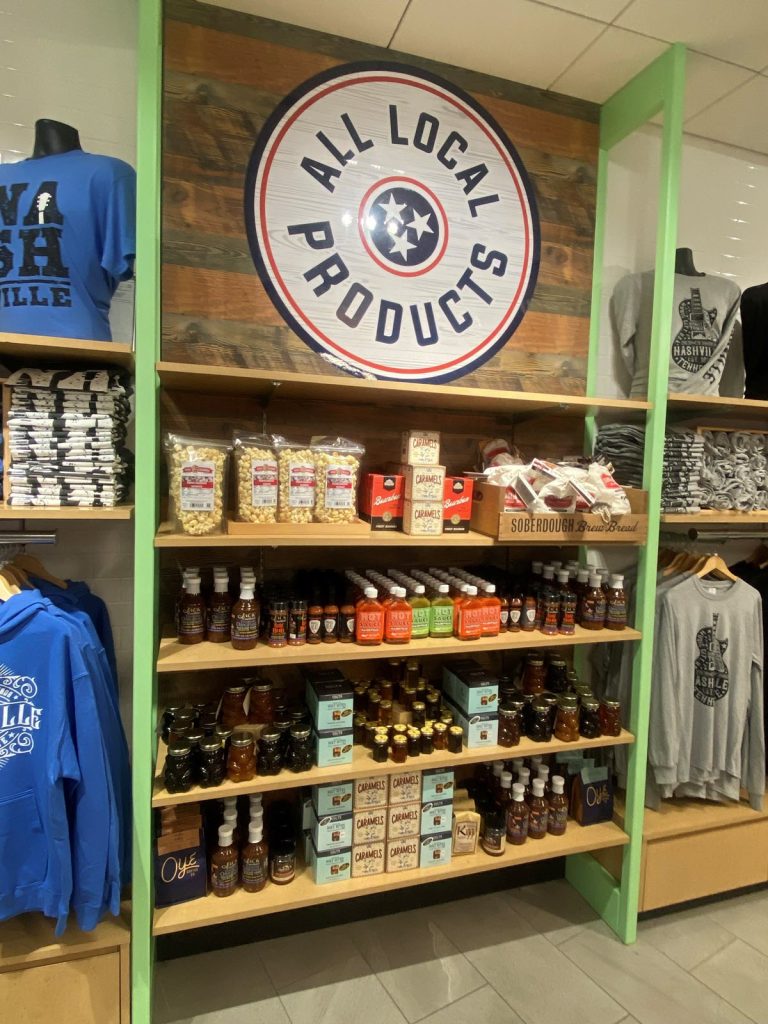
Signage will never go out of style, but what I loved most about this sign was the simple yet bold identification of what it was. This not only brought character to the store environment but also shared the message of local products, which many customers seek and value.
In your own store, what is something you offer that truly stands out or deserves this type of focused attention?
Leverage your wall space to create a statement that also directs customers to what they may be looking for. Collectively, this is a dynamic way to enhance your store while also supporting consumers.
Do not overlook the value of style here as well. Take the time to thoughtfully create a statement that is also aesthetically pleasing.
Finally, remember to always look to others for inspiration, encouragement, and ideas. Retail is a competitive yet beautiful experience, and when you look to others to learn, there is always something to gain.
Enjoy your next shopping trip with new lenses, so to speak, to possibly help your own store, too!
Nicole Leinbach is the founder of RetailMinded.com, a well-respected retail industry resource that has been recognized worldwide for its leading business insight since 2007. Her work has been featured in Forbes, Entrepreneur, Business Insider, the UK’s Telegraph, CNN, the Today show, and countless other industry resources. Additionally, she has supported American Express’s Small Business Saturday as a spokesperson and is the author of the book Retail 101: The Guide to Managing and Marketing Your Retail Business, published by McGraw-Hill. With a core concentration on small businesses and independent retailers, Leinbach welcomes you to connect via Instagram at @RetailMindedWorld and Twitter via @RetailMinded.


