By Amy Meadows
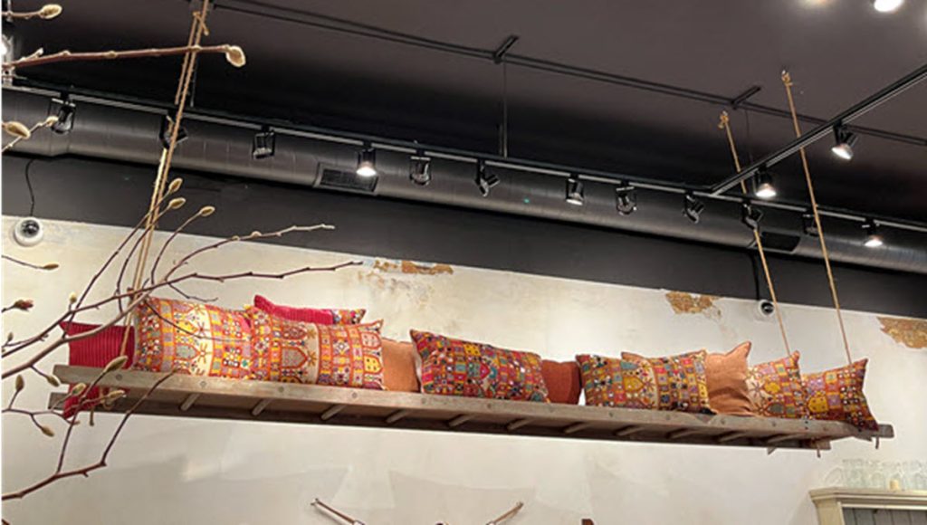
Creative Ideas for Overhead Spaces
The stockroom is full, the fixtures are at capacity, and your shop feels a bit too crowded to move and shop comfortably. What is a retailer to do?
While camouflaging empty spaces and merchandising gaps is a useful tool, chances are good that conserving and consolidating available space is a skill in heavy rotation.
The only way out is up! This does not necessarily mean moving your product up higher but evaluating the location of and space used by collateral and décor.
Yes, signage, props, and décor items are important, but merchandise takes priority if you have exhausted your storage options. Let’s get started.
Looking In
Step outside and take a long, hard look. Awnings, trees, and signage can impact the view of your storefront and its interior. Are your customers getting a clear view of your shop and your merchandise?
Ideally, the shopper’s gaze should be invited in and up toward the back wall. Fixtures follow that same upward axis, starting just below eye level at the entrance (think feature table) and continuing to an area a few feet below ceiling height at the rear. If there are taller fixtures, such as hutches, blocking that view, those are better suited to the store’s perimeter.
Looking Around
Again, spend a few minutes experiencing your store the way a shopper might. Whether it is age or lack of patience, I know I am particularly unhappy when I must bend over or reach too far to pick up an item.
Choose a focus area that is just a bit above or below eye level and slowly spin in place. While making one circuit at that single level, you want to see full-price items and solid stock levels.
You do not want to see clearance or assortments that have been picked over. What you want to see is your core business.
And, while I hate bending over to retrieve goods, I will understand if they are marked down. It is only fair to make me work for my markdown!
Looking Up
Given the type and condition of your store’s ceiling, drawing the shopper’s view upward is not necessarily something you want to do, especially if you are dealing with drop-ceiling acoustic tiles in poor condition. A fully restored vintage tin ceiling is a thing of beauty. But they are few and far between.
A long, hard look at your ceiling is likely to reveal some errant hooks, a bit of dust in the light wells, or leftovers from a leak. Clean it up. Paint over it — especially in spots where customers’ eyes might wander, such as the display window and above the cash wrap.
Those less-than-perfect tiles can be painted and even layered with graphics. I have seen vintage maps and dressmaker patterns put to great use as creative coverings and decorative decoupage.
Looking for Inspiration
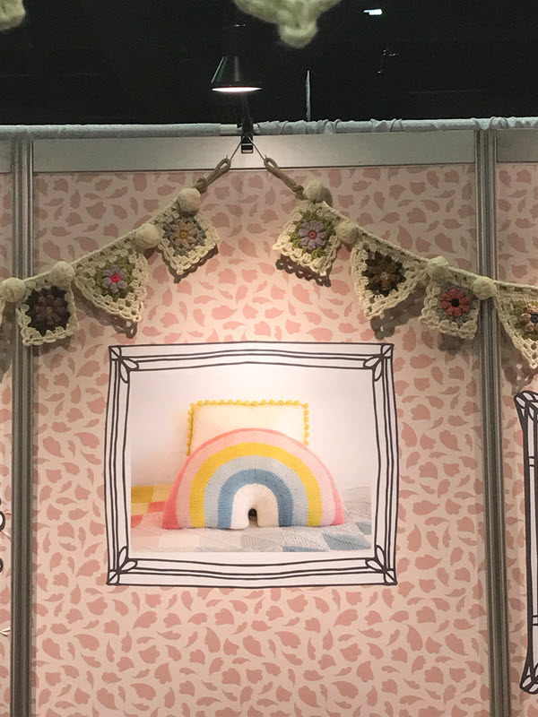
Great ideas are everywhere! It might be bunting or garland, installing hanging light fixtures, or adding fabric swags for a pop of color. I spotted many creative uses of inexpensive/brand-congruent flourishes on my travels.
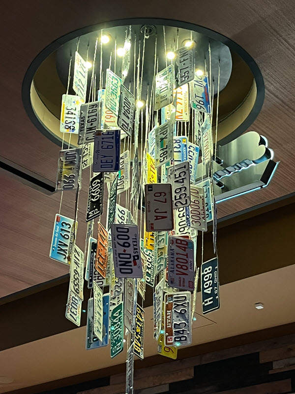
When your town or business is a regional or national destination, license plates, state flags, sports jerseys, or other memorabilia are a fun way to underscore the mix of visitors and backgrounds. A series of screw eyes, securely mounted to the light fixture, provide safe hanging points for this cascade of license plates.
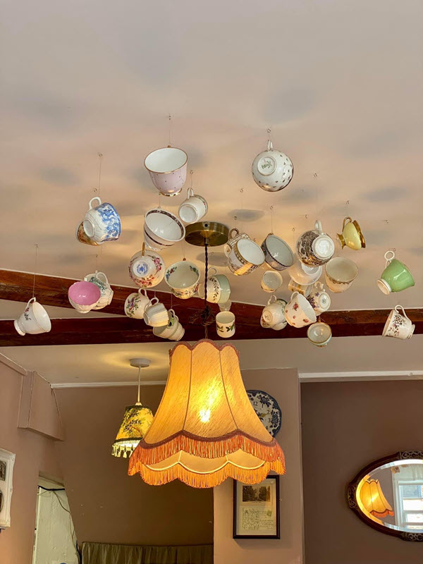
It must be time for tea! Look at this delightful array of teacups in a variety of sizes, colors, and patterns. The lamps cast a glow upward, creating a bit of a reflection on the well-polished tableware. The handles make them a natural prop for hanging versus saucers or flatware.
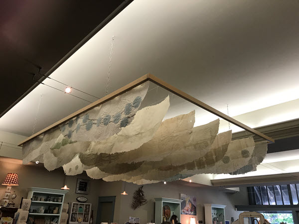
Here is a simple, suspended frame with panels of handmade paper floating within it. In this situation, the ceiling has been brought down instead of drawing the view upward. This “canopy” provides visual interest and a sense of intimacy at checkout.
As I frequently mention, inspiration is everywhere. Keep your eyes open for creative uses of overhead spaces at restaurants and hotels. The hospitality industry relies heavily on making guests feel welcome and building repeat business. Does that sound familiar?
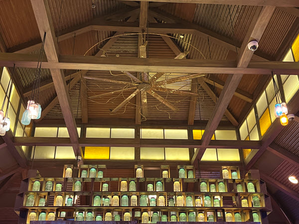
Why just hang a bare bulb when you can use a Mason jar as a cover? I have also seen this executed with carafes and decanters. Variations in glass colors and patterns add visual interest to an often-neglected overhead space (and that fan — wow!).
Have an interesting display to share? Or a question about visual merchandising strategies for your business or your district? Visit www.windowsmatter.com for more information.


