Artist Claes Oldenburg describes art as a technique of communication. “The image is the most complete form of communicating,” he says.
This is also an apt description of the practice of retail display. Visual images convey information, mood and ideas to the customer. For new store owners and seasoned veterans alike, visual merchandising is a vital component of retailing and one that must be planned and updated continually to obtain the best results. You don’t need to be a professional artist to understand how art works, though! Harnessing the power of art to communicate creatively with customers begins with the basics.
To understand the principles of how art relates to visual merchandising, look at retail displays and store layouts as analogous to an art museum setup—it’s a great way to think about how displays are viewed by a customer.
When you approach an art museum, most likely some type of kinetic sculpture is positioned outside the entrance: a fountain that splashes and gurgles or a metal and fabric pinwheel that springs to life with the barest breeze. The sculpture serves a definite purpose: It builds awareness, energy and anticipation for what lies ahead. Movement, color, sound and texture work together to prepare you for a new and exciting experience. You can use this concept in your store by incorporating such kinetic elements outside your business’s doorway. Add a flag, a wind chime, a fountain or another attention-getting piece to welcome customers with energy. Outdoor music is another great tool for setting a mood.
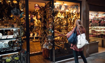
Once inside a museum, you sit on a bench or walk up and view paintings hung on the wall in front of you. The optimum viewing point for most pieces of art is 6 feet to 10 feet straight in front of the piece, either standing or sitting. This is similar but not identical to the perspective for window displays. The caveat here is that people don’t see your window displays straight-on: In a car, they whiz by at 35 miles per hour and glance over at an angle, and on the sidewalk, they rarely turn 45 degrees to view a display. Most pedestrians view window displays when approaching them, which is at a 25-degree angle. So, angle your window display at 25 degrees, facing out to oncoming traffic. The displays closest to your door should angle toward the doorway, thus leading customers into your shop. Lighting window displays is as important as lighting a museum’s paintings—visibility of the displays’ contents is your goal, even in the daytime.
As you walk through the museum, you might approach a sculpture. You would move around it, looking at every facet of it from different points of view. Sculpture is dimensional—it requires viewing from all angles for maximum impact. Interior store displays are similar to art sculptures in that they are viewed from multiple points as a person moves around the shop. Therefore, there should be no ‘back side’ visible in an in-store display—all surfaces should be lovely to look at and should hold product appropriately. If you build a display that includes a great painting or mirror showcased on an easel, drape fabric over the back of the easel so that the back side of the display isn’t overwhelmed by an ugly paper backing. If you use a different product or color at the back of a display, it should relate to the front of the display to form a visually complete whole.
In another part of the museum, you might see artifacts and precious creations housed in glass cases on pedestals. You would circle them as you gazed at their intricate detail. These are generally the most fragile items and also those that require a close point of view to appreciate their craftsmanship and detail. Terms such as “precious, valuable and rare”—all terms that carry a sense of increased value—are used to describe these items. Build on this perception for your products by creating a showcase for similar items, such as jewelry, fine pens, collectibles and antiques. Provide focused, bright light to give prominence to the collection, and arrange items with care in each case, cube or cabinet at a height that allows viewing of tiny details. Don’t crowd the pieces—think of them as individual sculptures.
As you leave the museum, you might pass through the museum gallery, where you would be invited to attend a lecture or a tour. In a retail store, the gallery translates to the cash-wrap area. Here, you should provide your customers interactive opportunities before they check out. Advertise upcoming events and sales. If you are having a garden party, make a flier and stick it in the prongs of a lawn rake that stands in a potted plant. If your sale is on coastal items, stand the fliers in a sand pail.
Designing and building a display is like painting a still life—you must include a focal point (your product), fixtures (whatever holds the product), props (accents that bring the product to life) and various other design components. If this sounds overwhelming, be assured that it isn’t. Study works of art in books, museums or online, and you will discover how artists combine the basics with their own style to create varied looks, themes and moods. You can do the same thing in your displays. Remember, you aren’t just selling product—you’re selling your unique ideas and inspiration!
Color: Just look out the window during any season and discover the perfect palette. Every color combination found in nature is successful because there is a balance of warm and cool hues and light and dark shades and the inclusion of a neutral (black, white or brown). Be inspired, not intimidated!
Light: Study black-and-white photos or sketches to see the power of contrast; both light and shadow are necessary for establishing an effective focal point. Pull this concept into your displays by varying the strength of light in your setups—wash the backdrop with soft light; focus a bright beam of light on the products; and let the fixtures holding the products fade into partial shadow.
Space: Empty space is not a waste. In displays, empty space is as important as the products: You cannot fill every surface to the brim with color and product and then expect people to look at it. The visual confusion overpowers people! The eye needs a place to rest, so you must incorporate clear spaces to balance the weight of your props and products. Train your staff to leave empty spaces empty! Loading the spaces with products will not increase sales.
Scale: The size of the display area plays into the equation. Your props and the size of product you place there must be balanced with the space. In the case of windows, large-scale displays are best, as they are viewed from a distance. Keep your colors vibrant, your lighting strong and your products large. Once you draw customers into the store, you can slow them down with fine details in your interior displays.
Composition: Combining perspective, angles and textures allows for varied looks. A triangle-shaped arrangement, whether centered or offset to the side, is always successful; the dynamic angles add energy to your display. Height in the rear of the display is vital for lifting product to the customer’s eye level. Your focal point should be in the middle third of the display area—place your largest or most colorful item there. Study still-life paintings by the Dutch masters for placement ideas.
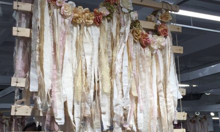
A display designer’s most versatile tools are props. These should be an extension of your store’s style—rustic, elegant, shabby or quirky. Find unique pieces that tie into the overall look and mood of your space. Infuse personality into your displays by incorporating one-of-a-kind items, flea-market finds or pieces custom-made by a local artisan. Peruse magazines, catalogs and trade shows for items you can use as props to bring your products to life.
By treating visual merchandising as artwork, you can present your products in a fresh way and maximize their effectiveness. Inspire your customers with color, light and your individual style—and give them an art education in the process!
Visual design expert Debi Ward Kennedy has devised a top 10 list of fast, cheap and easy items that can take displays from ho-hum to happening.
1. Paint! Buy it for $3 a gallon from your local home improvement center’s “oops” rack, and play to your heart’s content. Mix, match and create vibrant combinations, and use color to your advantage. Paint the walls, the floor, the props, etc.
2. Fencing. Whether composed of white pickets, wood planks or curled wire loops, premade fence sections are great for forming backdrops, canopies, runners, platforms, tabletops, headboards, trellises and a million more things.
3. Window Frames, Trellises and Ladders. Hang them on the wall; dangle them from the ceiling like you would a pot rack; or use them as headboards, picture frames or wall shelves. Take a fan trellis and turn it upside down. Paint it black; it’s the Eiffel Tower. Paint it green; it’s a Christmas tree!
4. Chairs. Collect mismatched chairs and use them to add height to displays. Stack them on tables; hang them from walls; or create a toppling tower of chairs and decorate it like a Christmas tree.
5. Natural Elements. Rocks, branches, grasses, shells, sand, bark—they all add a “touchable” side to your displays. Get out of the store and into the wild for some unique props.
6. Books. You can find books for less than a buck at thrift stores and library sales. Stack them as pedestals; scatter them as leaves; or fold them into a sculpture. Feature gorgeous book covers and typefaces in jewelry displays, or paper a wall with a classic children’s tale to add style.
7. Lighting. Use paper, foil, plastic or steel mesh to create freestanding shapes around uplights, or hang huge paper lanterns as backdrops.
8. Mannequins. Pull a Henry VIII and remove their heads. Replace the heads with stare-inducing items such as basketballs, briefcases, clocks, balloons or cotton candy.
9. Words. Print out your slogan, your brand names, your favorite quotes or even gibberish and mount the text on a backdrop or on windows to get your message across. You can use anything from playful fonts to dictionary script to build a mood that’s letter-perfect.
10. Movement. Leaves, snowflakes, streamers—whatever your preference, get something in your display moving with a small motor or an open window. Filament/fishing line is a strong yet invisible support for all things ephemeral.
Debi Ward Kennedy is a retail visual design consultant with more than 28 years of retail experience. In addition to designing displays and decor, she presents seminars on visual merchandising and writes articles for local and national publications. Based in Seattle, Washington, Debi can be reached via www.DebiWardKennedy.com.


