
PHOTO COURTESY OF KAT FRIEDRICH / AWESOAP
By Amy Meadows
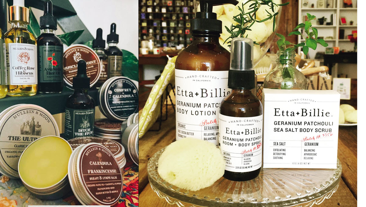
Refresh Personal Care Displays With These Tips
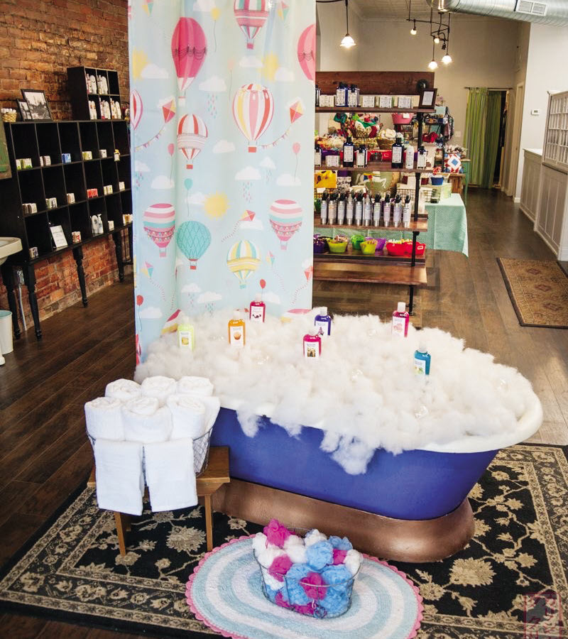
Ah, yes . . . that nursery rhyme with three men in a tub — the butcher, the baker, and the candlestick maker. Except in this case, it is a soap maker, skin-care specialist, and bath bomb magician.
And, yes, they will benefit from a tub as well — at least for display purposes! Glass baubles, bubbles, froth, and more can spark the imagination, helping the customer imagine how wonderful a bubble bath might be.
When I am shopping for personal care splurges, I can spend hours sniffing soaps or sampling lotions and imagine how wonderful it would be to treat myself (or someone else) to these products. They are appropriate year-round, whether it is for a whiff of spring or the perfect stocking stuffer.
Given the open time period, what are some ways to refresh and update your displays of this single category throughout the year? Here are worthwhile considerations for maintaining shop ability and creating eye-catching visuals related to personal care products.
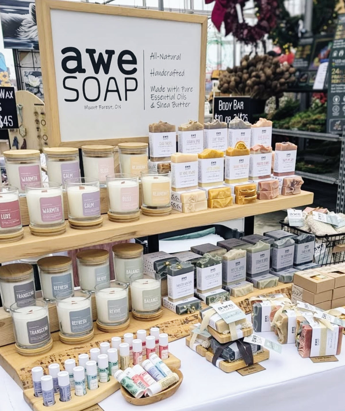
Step Units
As we know, making it easy for customers to find products is key. And this category is no exception — especially if bars of soap take a tumble across the table like dominoes.
Avoid long lineups of products and look for tiered or step units. Your line will be visible, with the stair tread letting you stand or stack bars of soap, tins, or creams easily.
When possible, avoid bringing merchandise all the way to the front edge of the table. A little breathing room is always welcome — both physically and visually. It provides a little forgiveness for swinging purses, bags, or stroller handles.
In addition, a riser unit elevates your product closer to sight lines and reduces the amount of bending and sorting required when everything is at the same height. In a pinch, upturned crates or open boxes can help achieve the same effect.
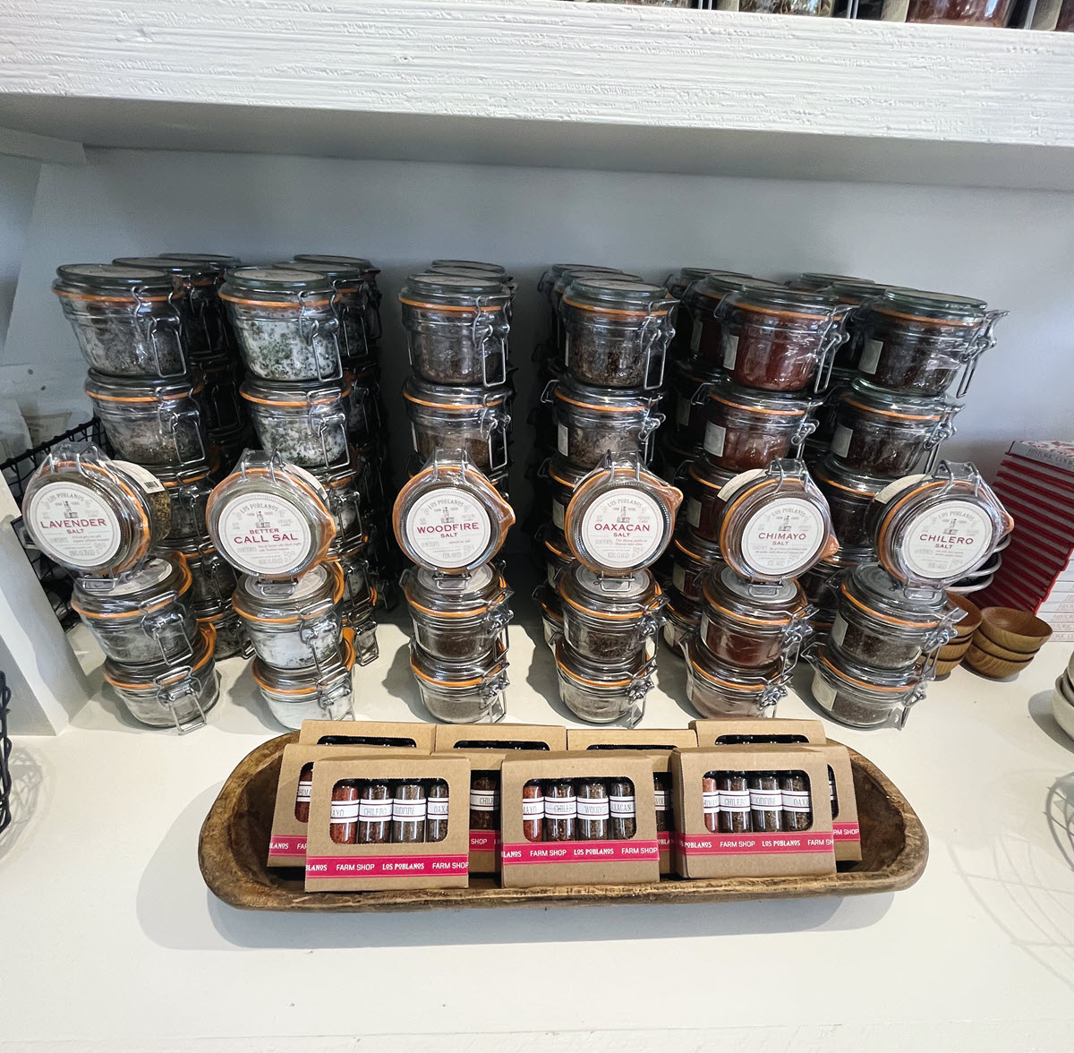
Baskets
Who does not love a good assortment of baskets? I routinely comb the shelves of Marshall’s and Home Goods for deals but with one specific aspect.
Given the gig’s nature or the booth’s size, I will look for baskets identical in weave and color. Too many mismatched colors, patterns, and sizes distract from the desired congruence your branded product will create. Keep the containers consistent, and your merchandise will be much more noticeable and distinct.
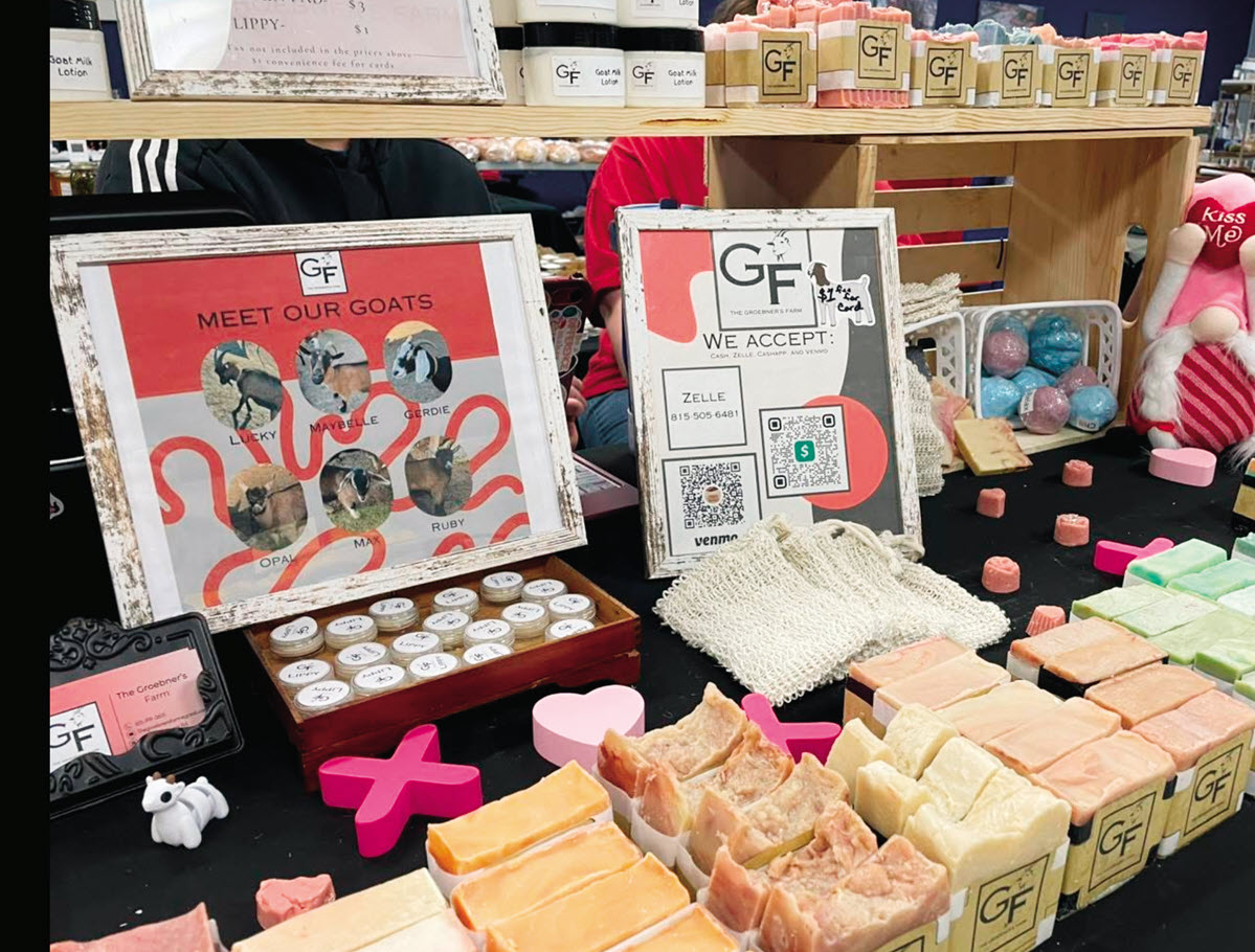
Storytelling
What makes you and your merchandise special? Made locally? Small batch? Organic?
If you can, please tell me a little about the history of the brand. Perhaps it was handed down over generations with time-honored techniques and ingredients. Maybe it was created using the newest, most environmentally friendly elements.
In short, tell me why I should buy from you. Quite often, the tipping point for me might be the way my purchase will support an organization or effort, with a percentage of the proceeds going toward those causes. Win, win!
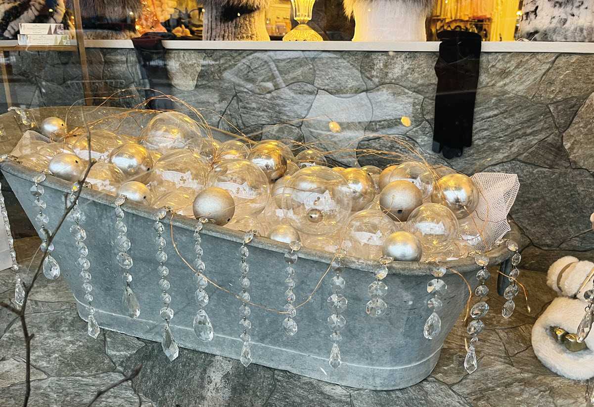
Seasonal Colors
Finally, do not overlook color stories or a seasonal connection for creating trend statements or special window displays. Think pink for spring, orange and brown for fall, etc.
Seasonal props can also serve as backdrops for your much smaller products. A visual anchor in a window moves seamlessly from there into the gift shop itself.
AMY MEADOWS PHOTO
Have an interesting display to share? Or a question about visual merchandising strategies for your business or your district? Visit www.windowsmatter.com for more information.


